New in the collection, pt. 7: Junior Initial Machine
This is the last in a mini-series that started on December 21.
⌘
I regretted not being able to put a DDR controller on that book spread, but I had one even bigger regret. It happened when I spotted this Shift key in a computer museum in Belgium in the late 2024:
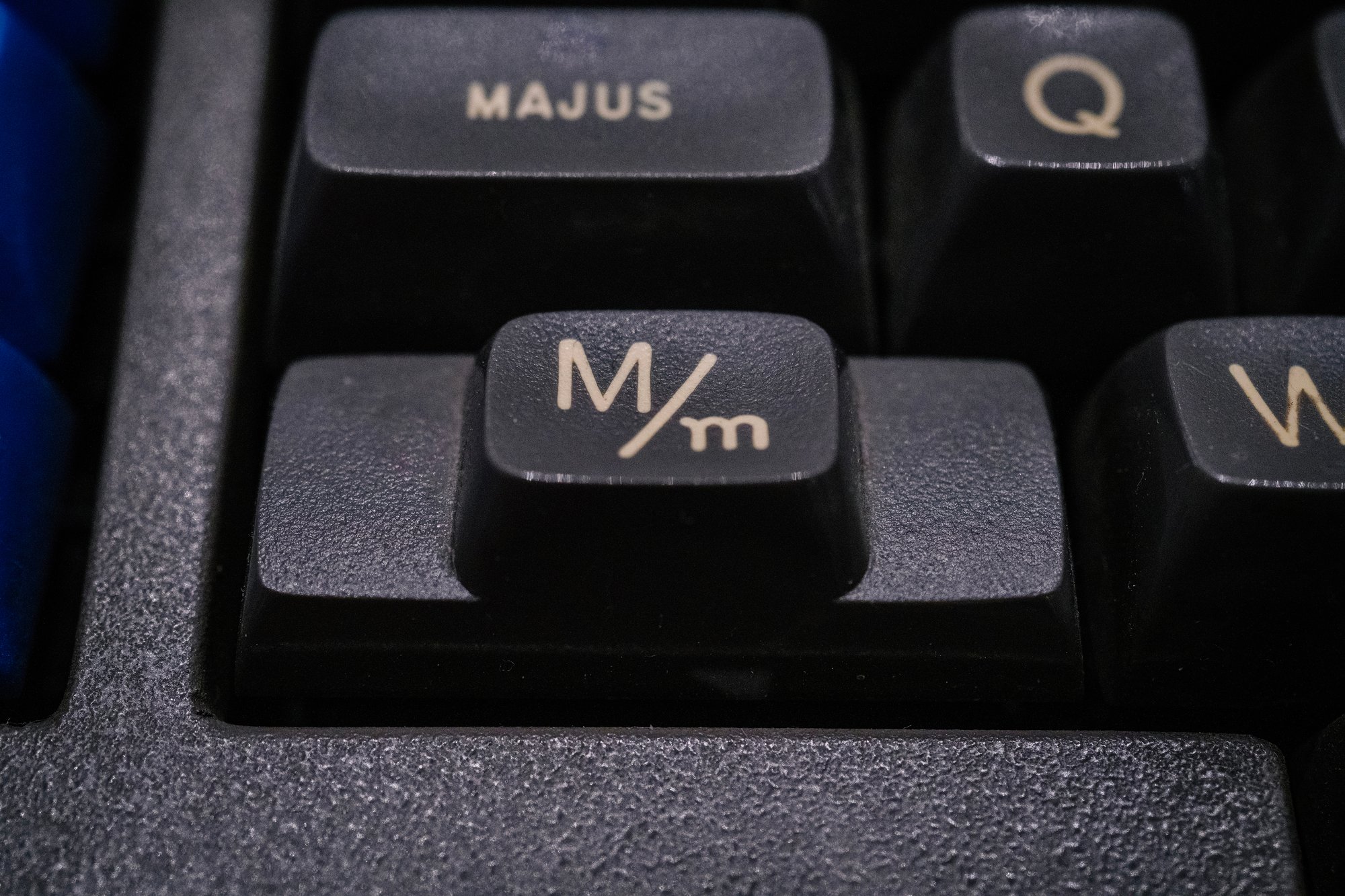
This was such a surprise. My book is called Shift Happens, I looked at a million kinds of Shifts, and yet I have never seen anything like this one before. I found it delightful; this is both such a European key (iconography over labels), and such a typographical one (referring to minuscules and majuscules). I would have immediately put it on one of the endpapers. But it was too late. The book was already out.
More stuff happened since the book was written. A Ming Kwai prototype was found!
Microsoft announced it’ll stop making keyboards, and then pulled a Unicomp.
Apple morphed Fn into Globe in an absolutely horrible way that makes their own ⌘/Apple Logo key 1980s–90s debacle look good by comparison. (I really cannot emphasize how much I hate what they’re doing there.)
I learned of this strange keyboard put on a smartphone prototype from Andy Rubin’s failed company:
At a museum in Australia, I discovered that DEC also had industrial versions of their keyboards (just like IBM):
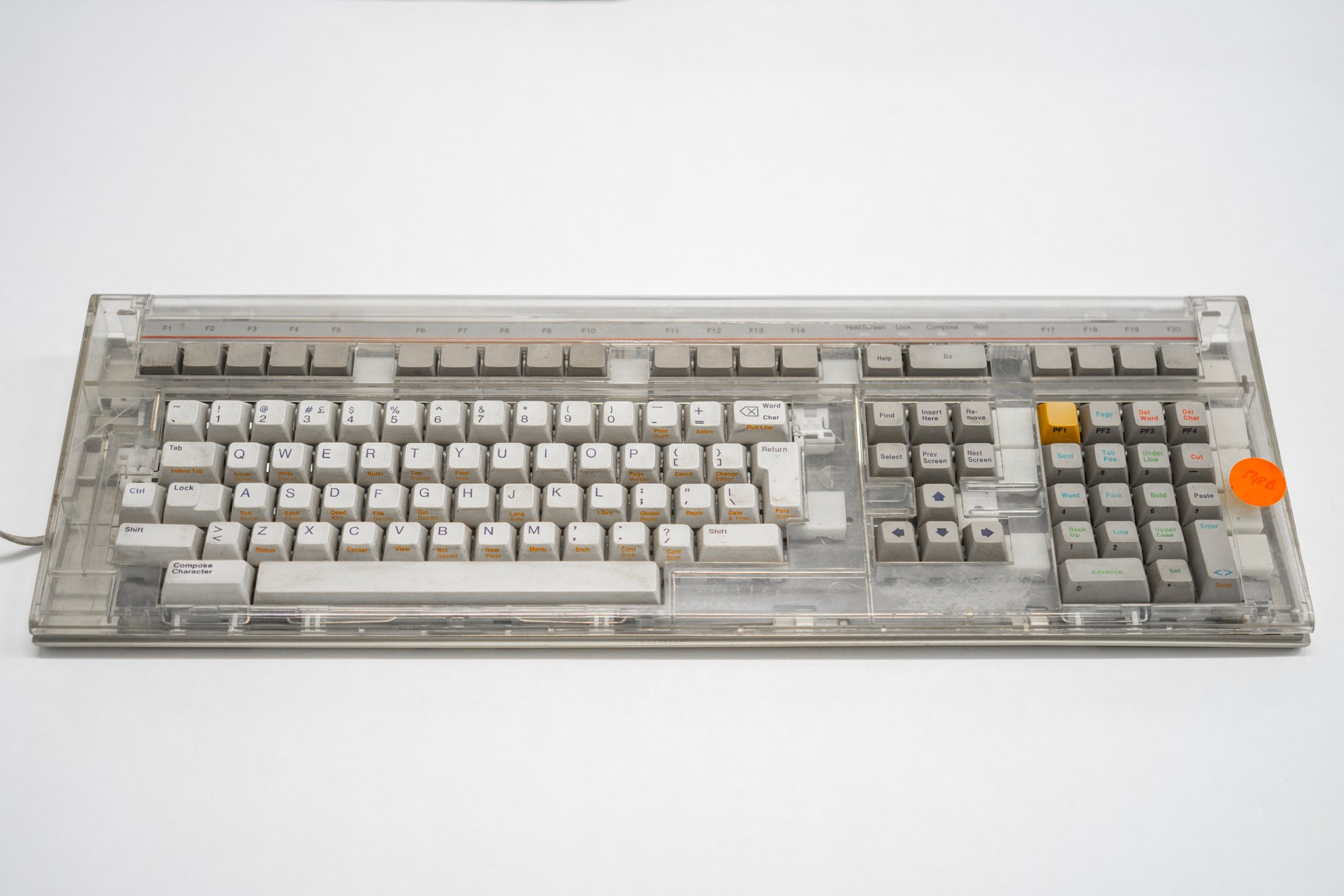
And that the legendary LK201/VT220 – the one that established the modern arrow key layout – also came in a transparent version!
I was absolutely delighted to discover a keyboard with a latching key that harkened to the way hi-fi equipment indicated pressed vs. unpressed:
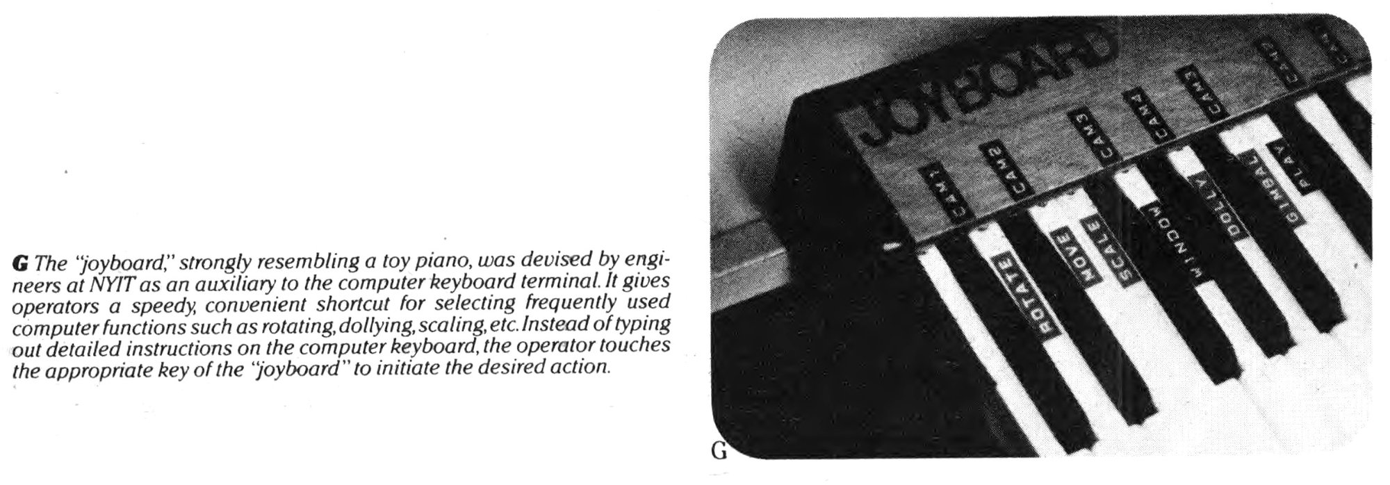
This one-off Joyboard seemed interesting (it would be a nice addition to this newsletter issue):
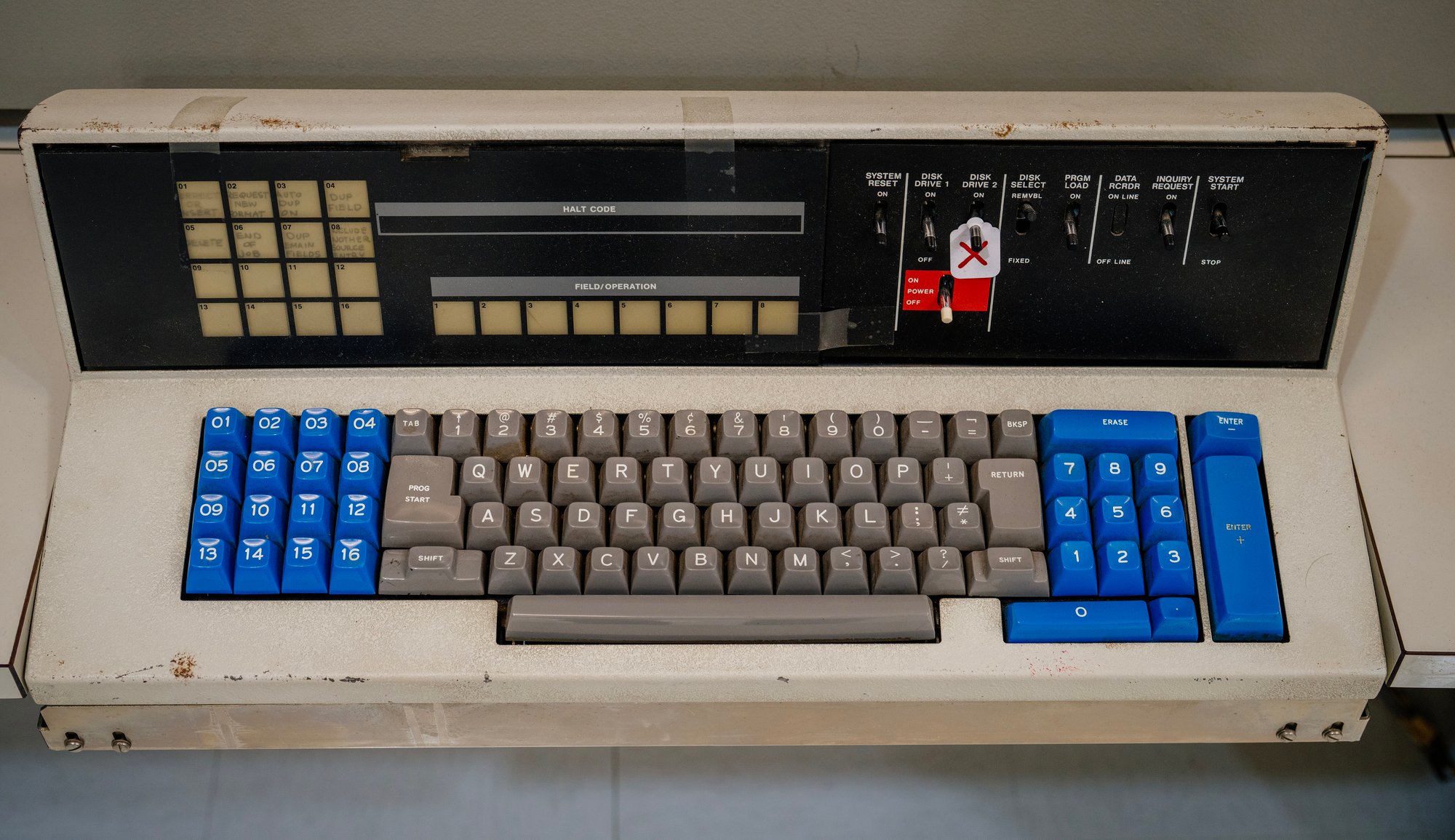
And in Baltimore, I finally pressed the biggest Enter (a full 6u!) I have known to ever exist:
This has always been the deal: Things will happen after the book goes out. And I will learn of new old things after the book goes out, too.
Completism is tricky, I know. Not everything makes for a good story, and not every nook and cranny has to be accounted for. I never particularly loved feedback that goes something like “well, you didn’t put my favourite keyboard in your book, so how good can the book even be?”
But not knowing of the new old things meant I didn’t even get a chance to decide, and that part is tricky to negotiate with.
At least, the last new keyboard in my collection I wanted to share would never have made it to the book, and I think you’ll understand why.
⌘
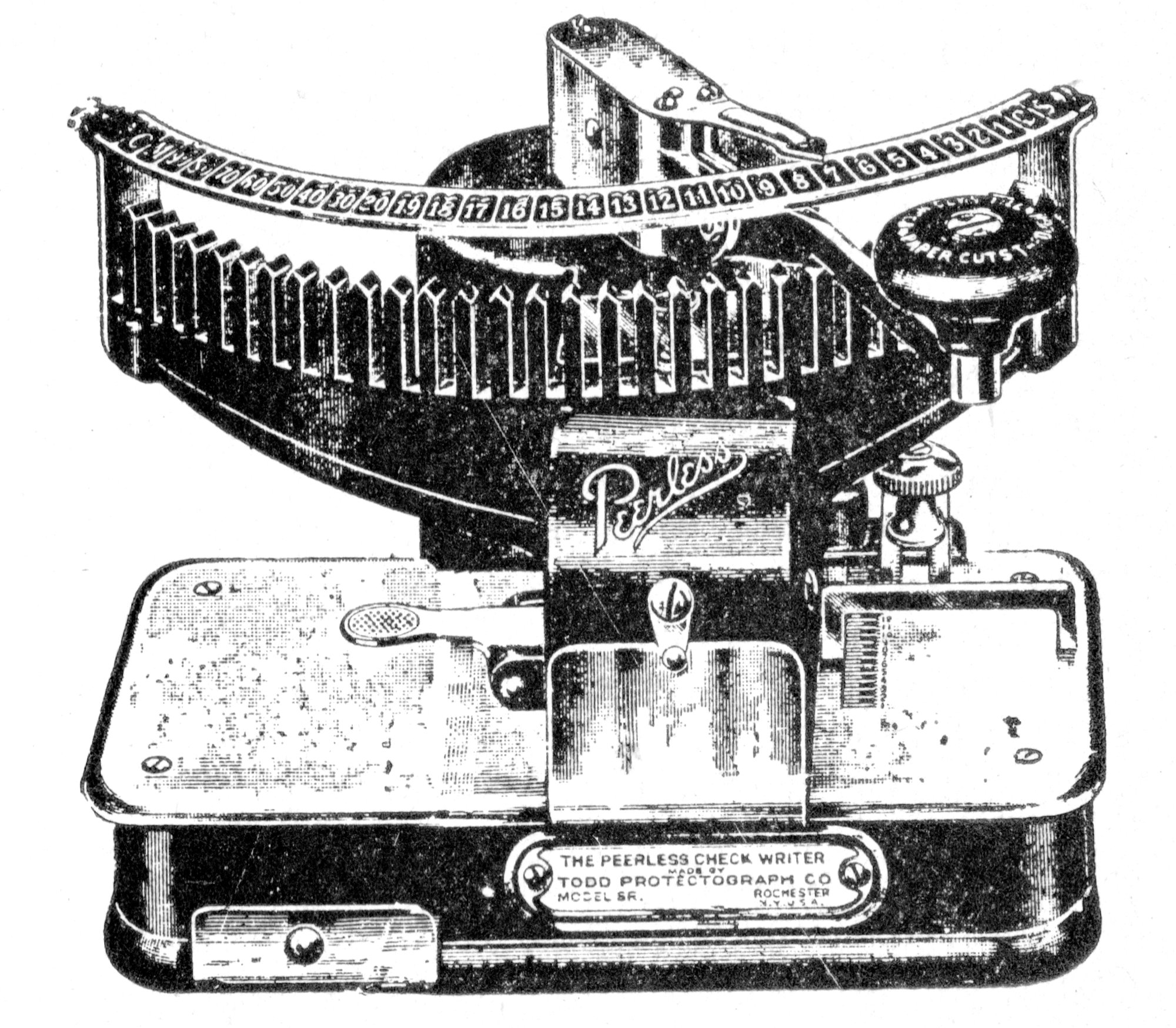
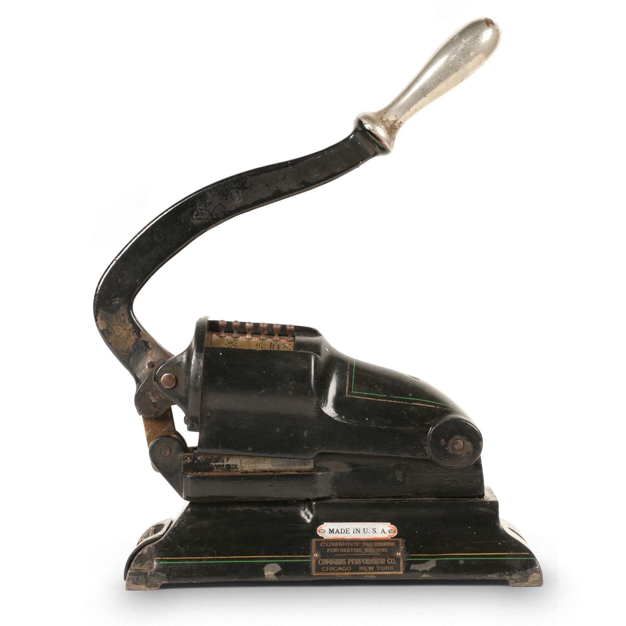
B.F. Cummins made his fortune in perforation.
Perforation is a security measure. Annotate something with ink, and someone can try to erase it. But once a hole is made, it’s impossible to un-puncture it.
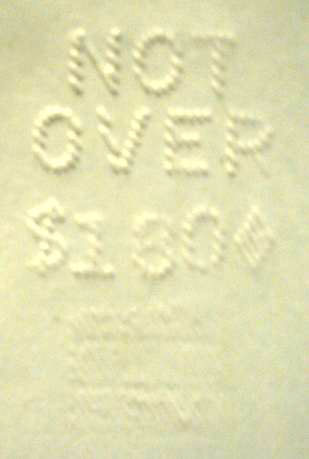
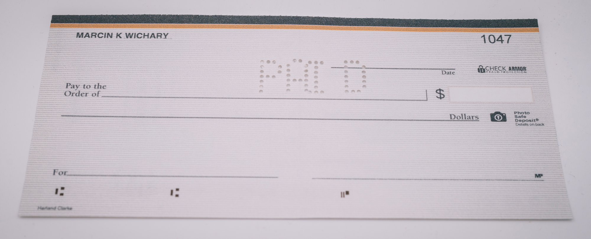
You can see this in banking; a cashed check can be prevented from being cashed again by adding a perforated PAID or a similar un-alterable decoration. The machines that do that are called check cancellers or check certifiers, and took over the traditional stamping that was easier to tamper with.
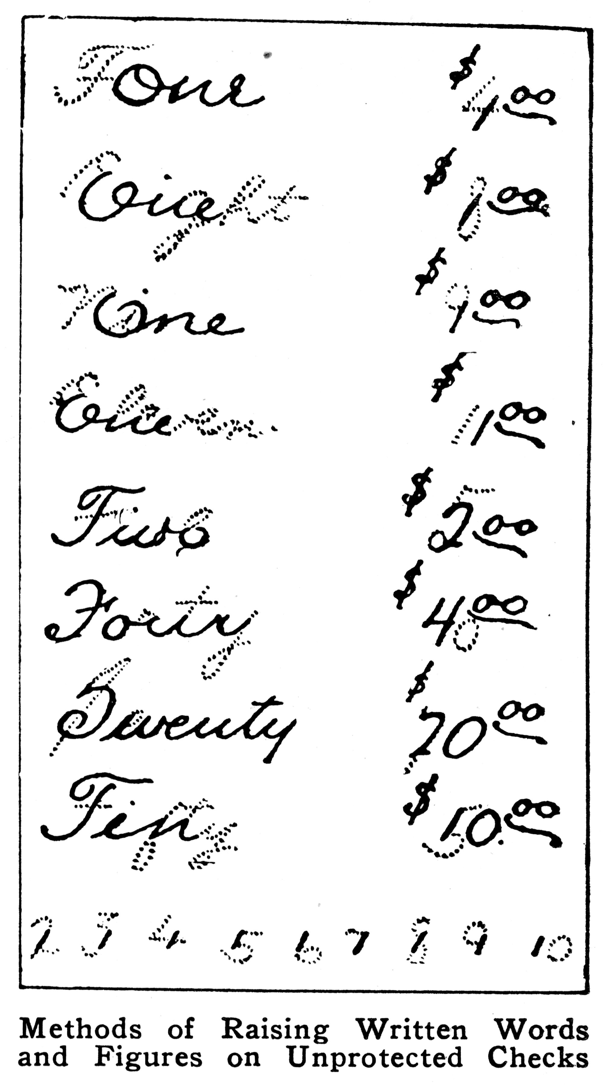
But that still doesn’t prevent a different kind of fraud – people modifying the check value before cashing it in. This was called “check raising.”
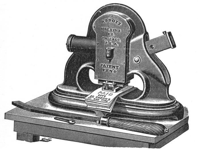
So starting in the late 19th century, various check protector products started floating around – some printing, some embossing, some macerating, some shredding, and some perforating. It was a whole mini-universe existing to embellish checks with something more secure than ink.
The simplest products made it harder to modify what’s already been written:
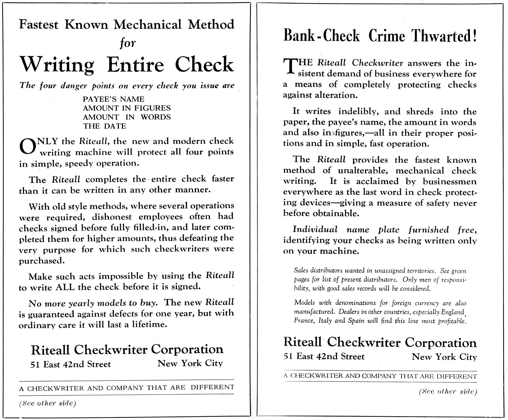
But the more complex ones did what the cancellers did – they added some extra information. However, the job here was more complicated because there isn’t just one word like PAID you could use to add security; the annotation somehow had to react to the number on the check:
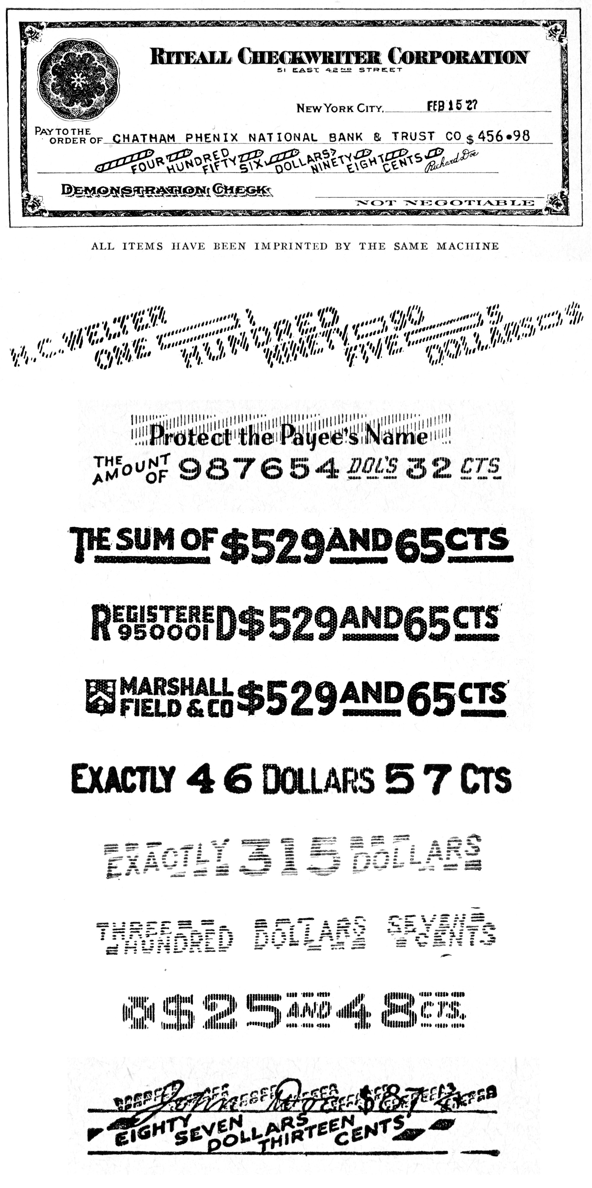
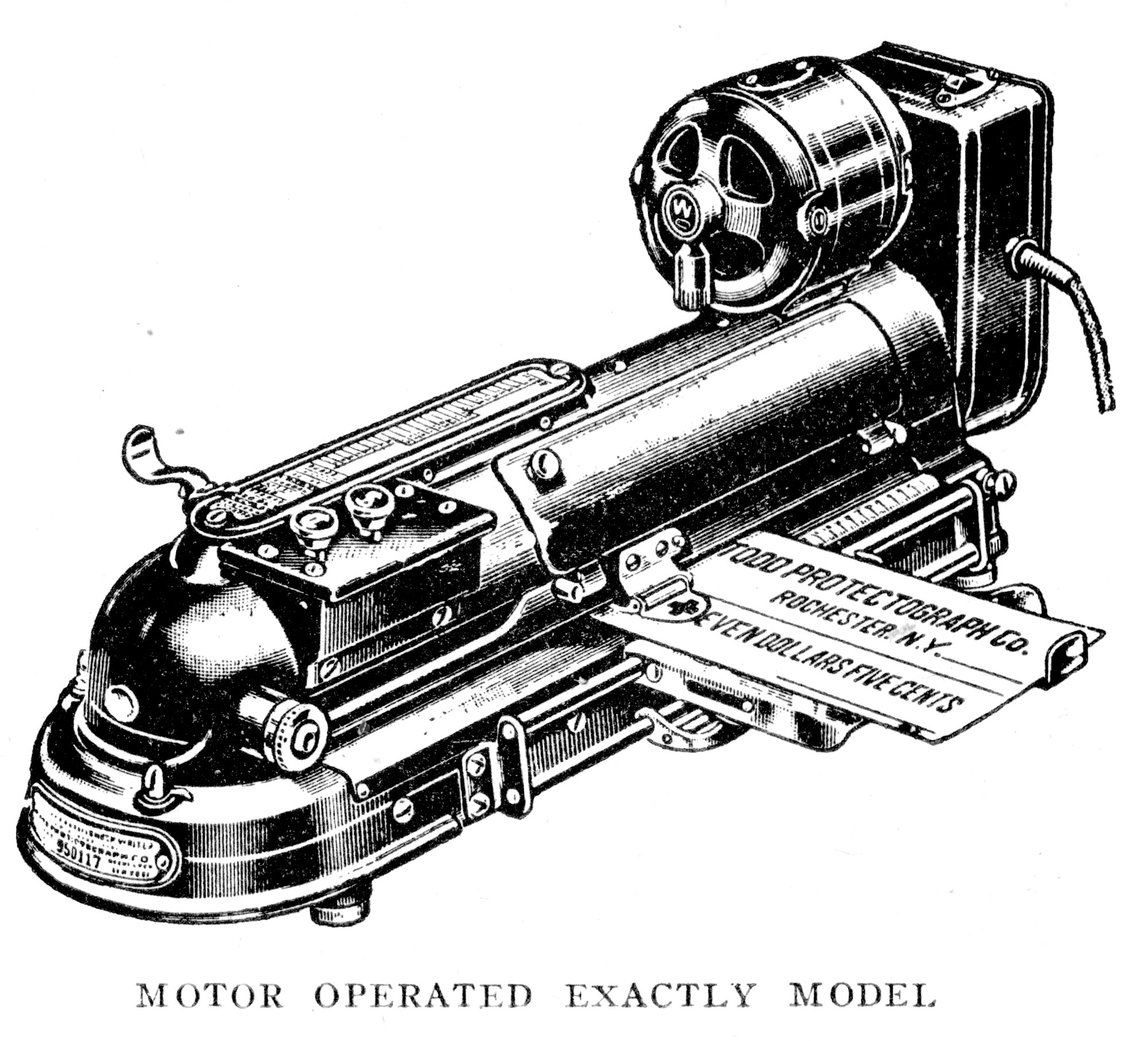
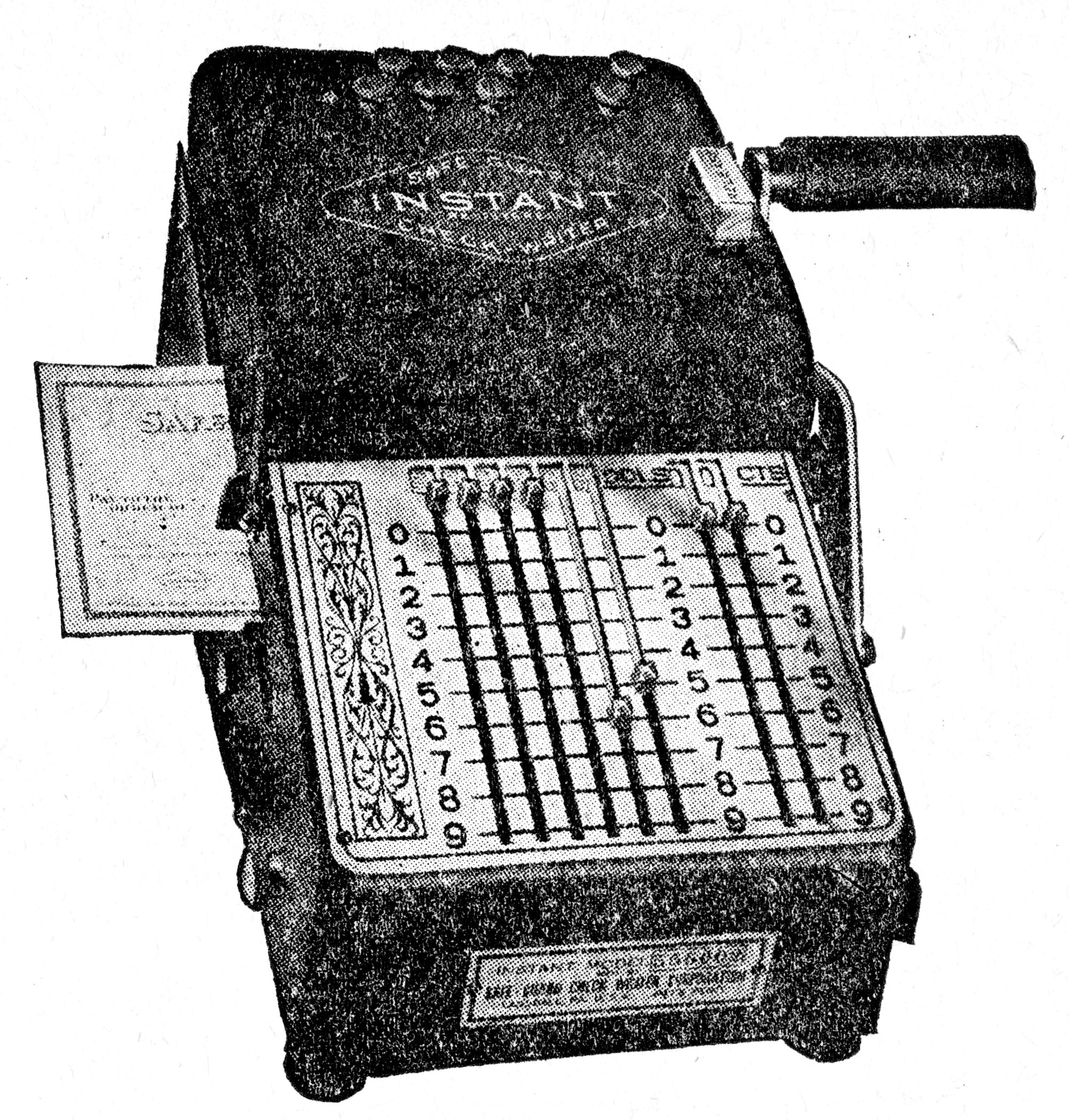
These all look like printed output, but that’s partly because that’s the easiest to reproduce. A fantastic old-school site called Early Office Museum has great examples of the variety of protections.
You know what, I’ll just hand it over to one ad for such product that explained this nicely:
So, you need custom output. But customizing the output means needing input.
Even the cheap machines that only printed something like “NOT ABOVE $20” would require their plates to be changed from the $20 option to the $10 option or the $100 one.
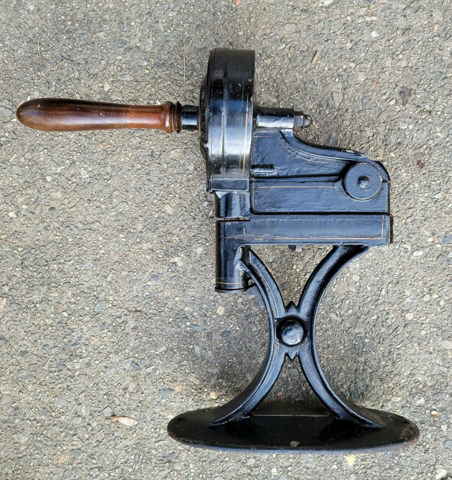
Other ones would introduce levers or dials or other means. (The first patent on those machines was issued in 1869, so they couldn’t fully rely on calculators or typewriters to have already solidified keyboards and their conventions – they were figuring them alongside.)
They’re cool in a way only old machinery can be.
And now I have one, and one that is interesting in at least three different ways.
⌘


This is one of B.F. Cummins’s products: the Junior Initial Machine. It’s perhaps the only 19th-century thing I own, far away from the brittle plastics and flimsy membranes of the Keyport 717.

How to use it? First, you slide a piece of paper into a slot at the bottom. Then, you use a “keyboard,” one that feels very similar to those index typewriters from chapter 3: you rotate to a desired letter left or right, with a satisfying series of metallic dinks. You can see it on the video below:
After letter selection – and this is what I was curious about most before getting the machine – you depress the whole top part to perforate the paper.
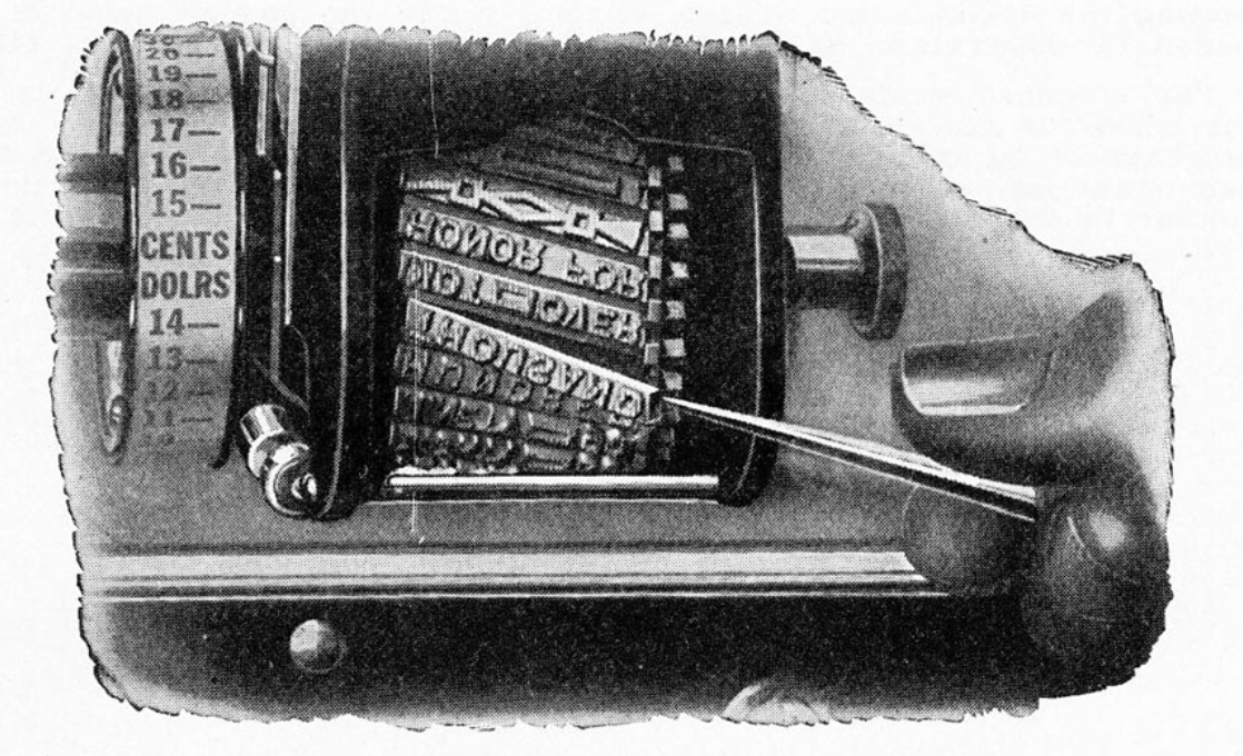
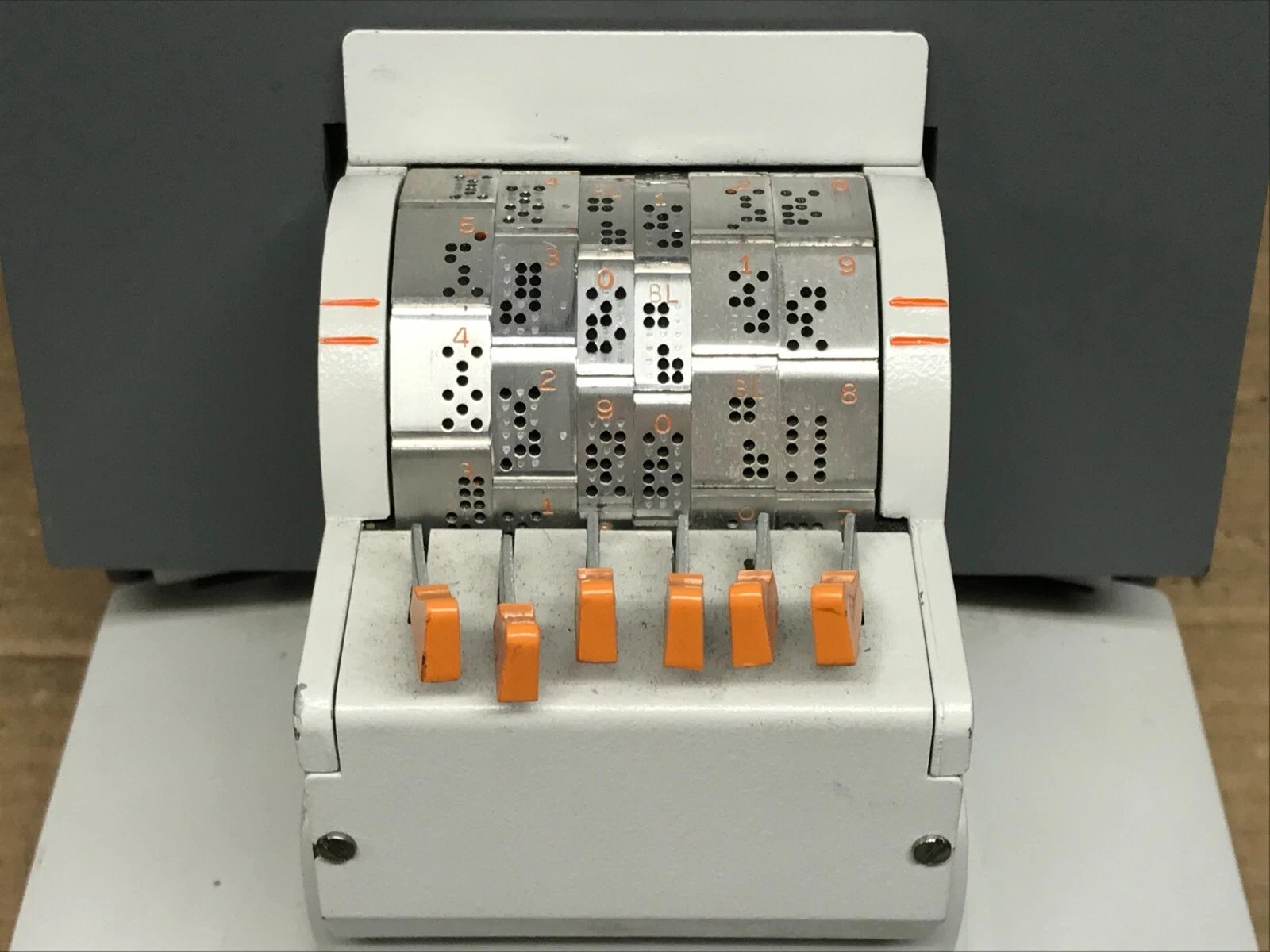
The second surprise after the “index keyboard” is that the output is not stencils or movable type. It’s, literally, a pixel font…
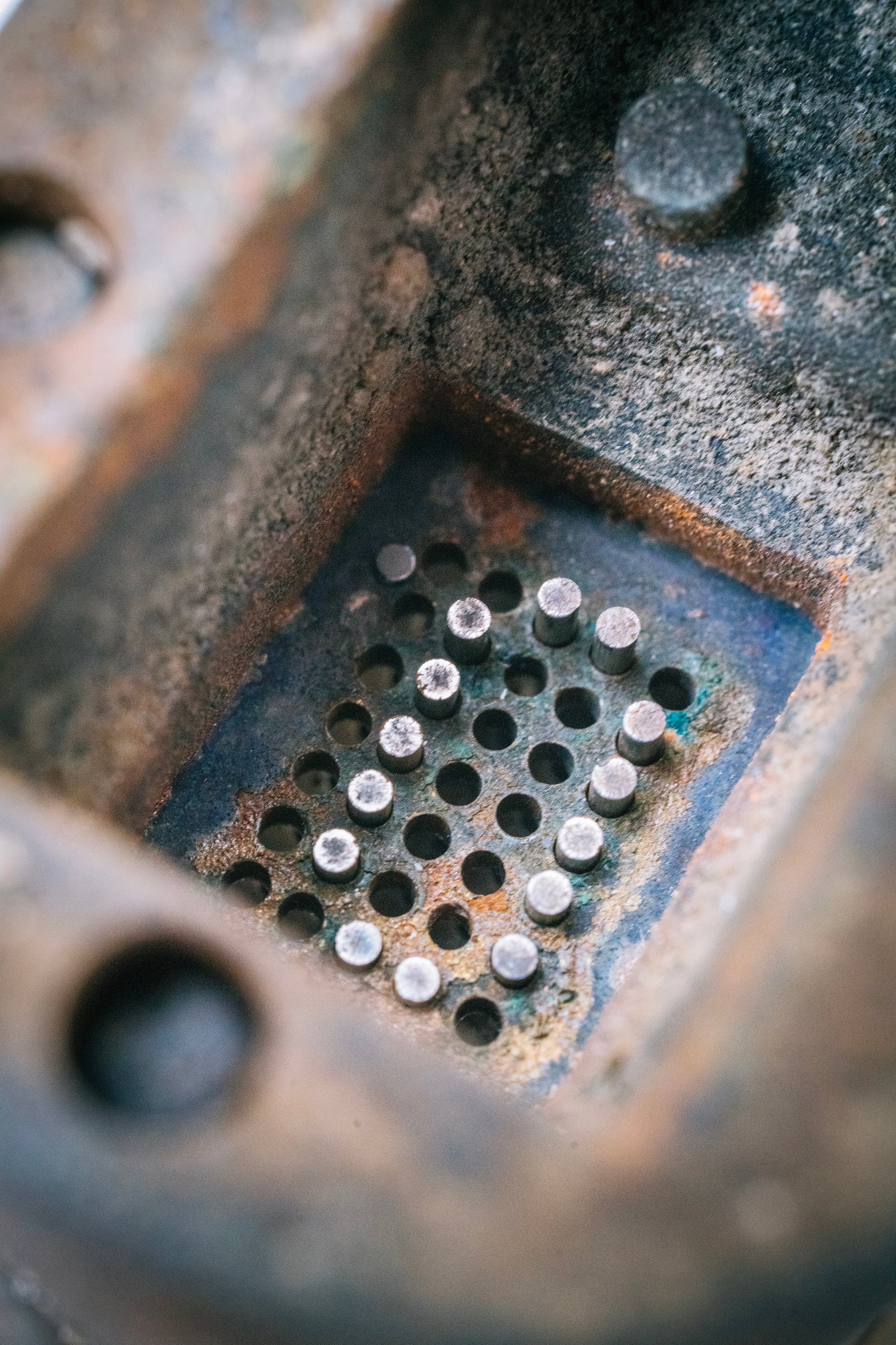
…except it’s all mechanical – no electronics, no electricity. Here’s the “pixel matrix” whose dimensions, 5×7, will be intimately familiar to anyone paying attention to more modern pixel fonts:
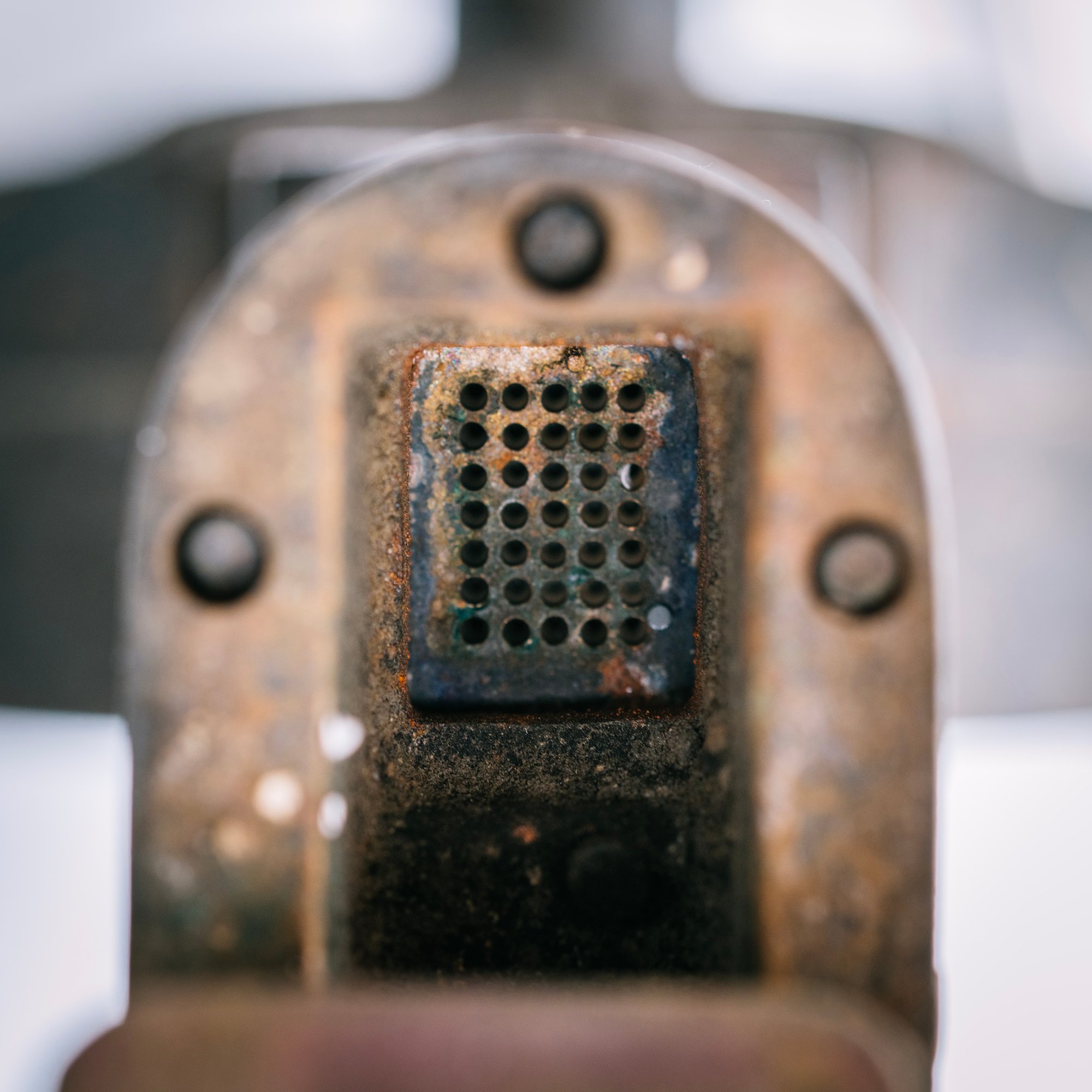
The entire font is encoded on the outer rim of the wheel that’s being rotated. Below, you can (hopefully) see the reverse of the letter O waiting in position.
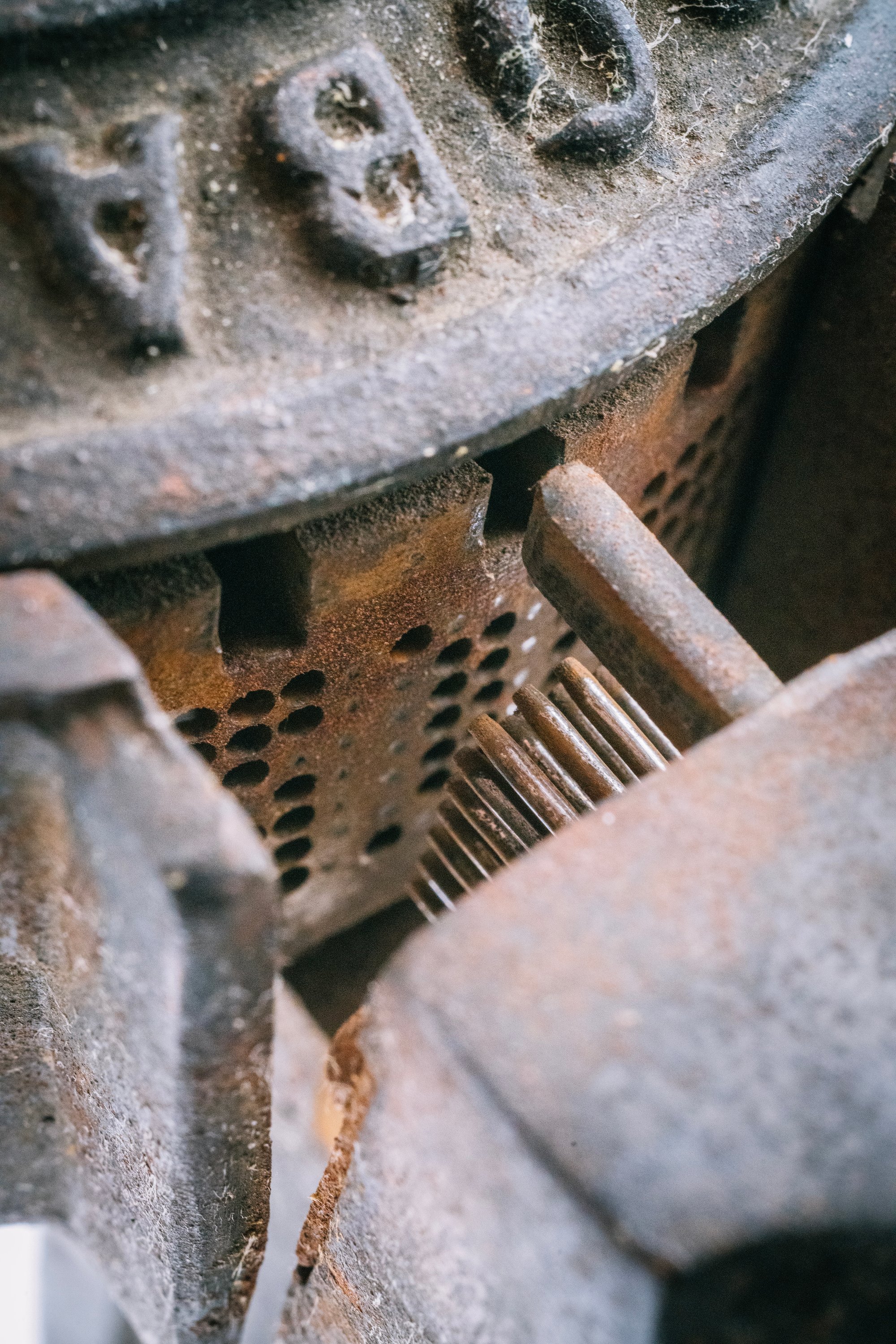
Upon depression, some rods are allowed to move, and some not. Those that get to move do the puncturing.
(You can also take a closer look at the patent if you’re the kind of person blessed with the ability to read patents.)
So that’s two interesting things. What’s the third one?
You probably realized the letters are too big for checks… also, no digits are even present!

This puzzled me for a while. But as far as I know this wasn’t meant for checks, or anything like that. Me using it on paper was an aberration.
I found this:
“This tool is a genuine antique from the late 1890s, when everyone wore hats and checked their hats at various venues so every hats store had a punch to add the customers initials to the leather sweatbands of their hats.”
And:
“Why did people have their initials perforated into hats? Many people, men in particular, wore similar or identical hats and wanted to make sure they got their own back when they checked them at restaurants and elsewhere.”
This was initially (heh) hard to imagine, but over and over again this is the explanation for this particular machine.
So yes, what I have is apparently, a… hat perforator.
⌘
Junior Initial Machine is heavy and clunky to use. It has seen better days and could use some tlc I’m ill-equipped to provide. Even without all that, it requires mastery, as you can tell from my poor horizontal alignment. It’s also hard to operate because it needs a lot of leverage; some of its versions came with a stand that I don’t have.
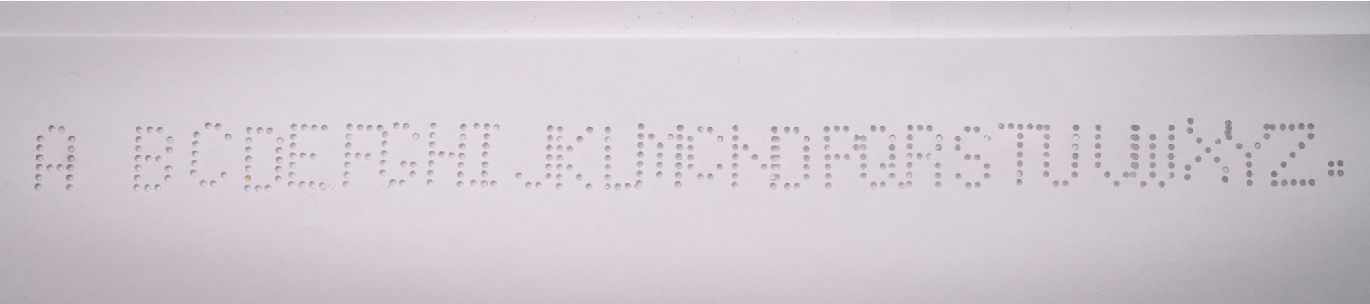
But it also has some niceties which remind me of the details of the Comptometers of the same era. The metallic thunks – you would call them “haptics” today – help you make sure you are always aligned to a letter. Next to the alphabet and a full stop existing for obvious reasons, there is also a superscripted C for names that need it, and put right next to M, too! (In an echo of that one typewriter with a mysterious r. key.)

And the engineers thought of adding a little container for chad, too.
I don’t know if the machine was successful or not. I see it online sometimes, often sporting slightly different names, suggesting that this line of products at least had some longevity.
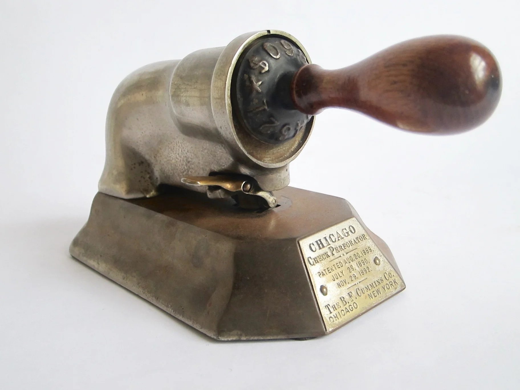
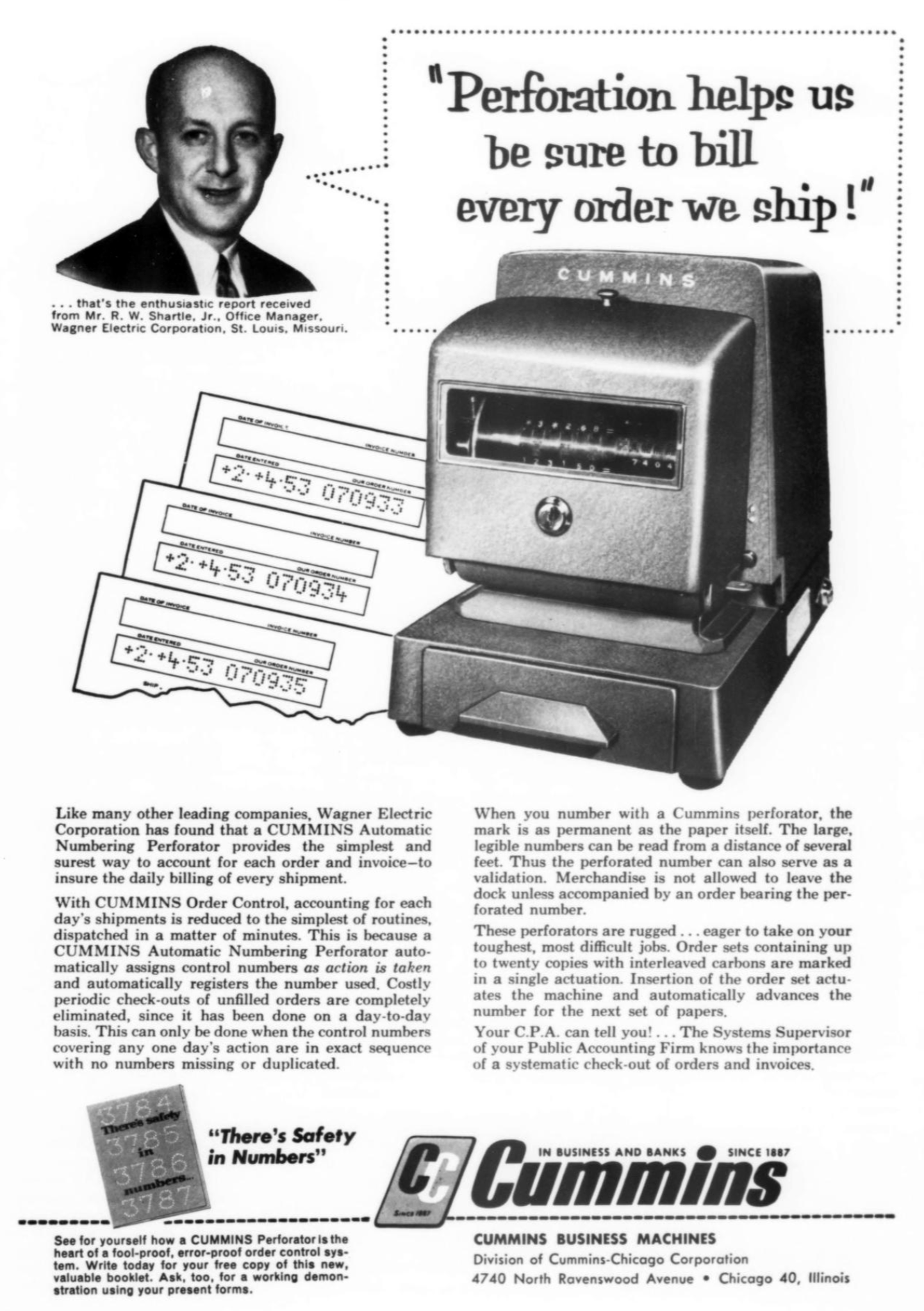
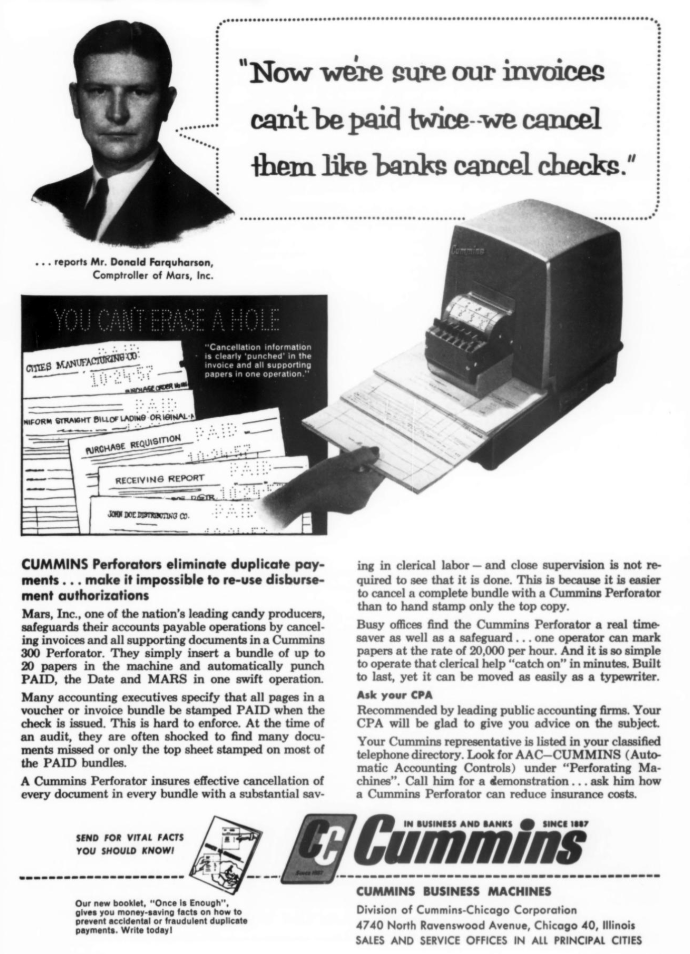
Cummins made similar check perforators – with digits only, and appropriately smaller – but also a host of other machines, including perforators for the post office, and much more modern machines.
Decades later, the company rebranded to Cummins Business Machines, with ads shouting “you can’t erase a hole.” Their non-pixel pixel game remained strong.
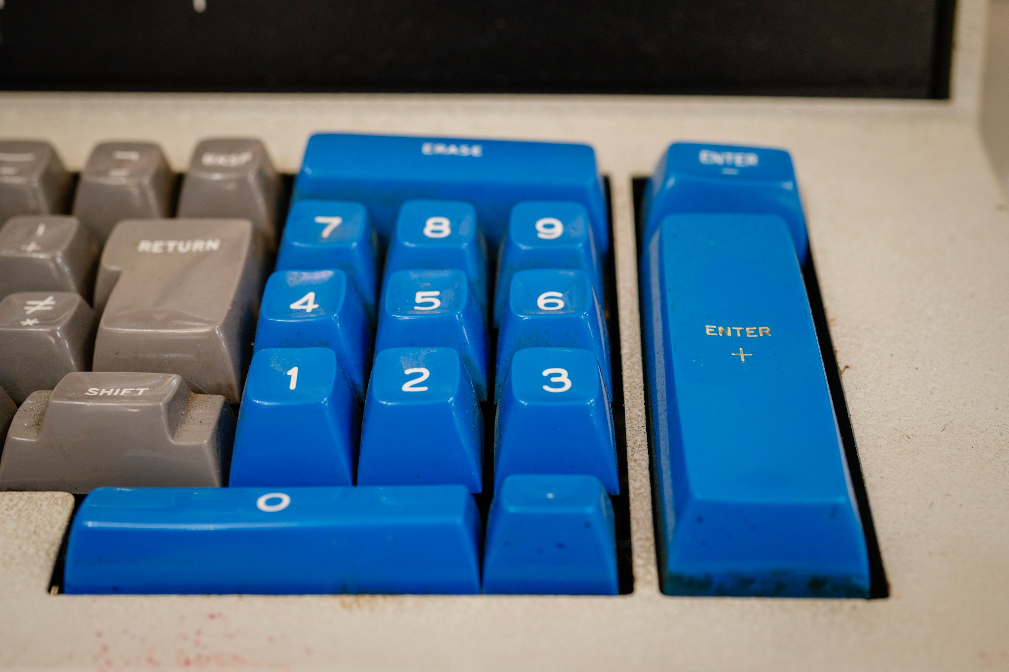
As far as I understand, some banks still use perforators, although they – like checks themselves – are extremely old-fashioned. As you would expect, some at the perforators use now-traditional calculator keypads.
I don’t know what happened to B.F. Cummins’s company past 1956.
⌘
If you noticed a trend in those seven most recent newsletters is me saying “I don’t know” and “I guess” a lot more often. It’s really great. It is nice to be faced with questions and not feel it is me who’s on immediate hook to answer them. It’s fun to be a civilian in a keyboard space, a tourist just passing through.
I started this entire newsletter in 2017 with a post called The worst keyboard ever made, talking about the PCjr keyboard but poking fun at a convention of simplifying anything to be “the worst” or “the best,” and the idea that quality can even be a singular axis. Later I reused the same title for the Royal Digital IV calculator keyboard and the Ukrainian clone of the Model M. The reusal itself was also part of the commentary.
Junior Initial Machine is another “worst keyboard ever made” – I mean, watch my video and imagine “typing” on it! – but it’s also a machine so blurry that you can revel in its blurriness. It’s a keyboard without keys or a board, a typewriter without type or writing, and a pixel font without pixels… and according to some definitions, not even really a font. (Some people say a proper font needs to include a means to properly position the subsequent letter next to the previous one.)
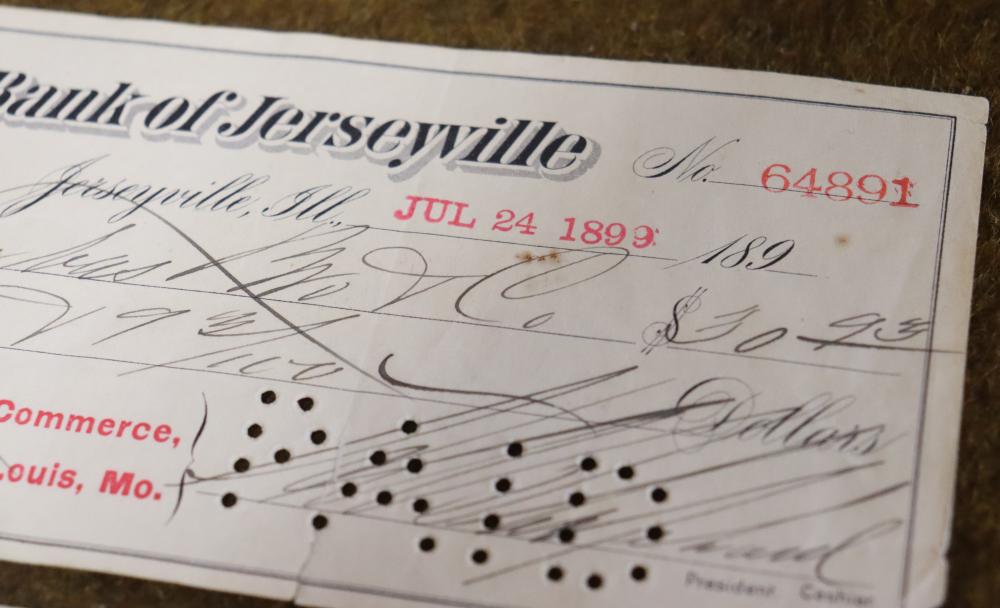
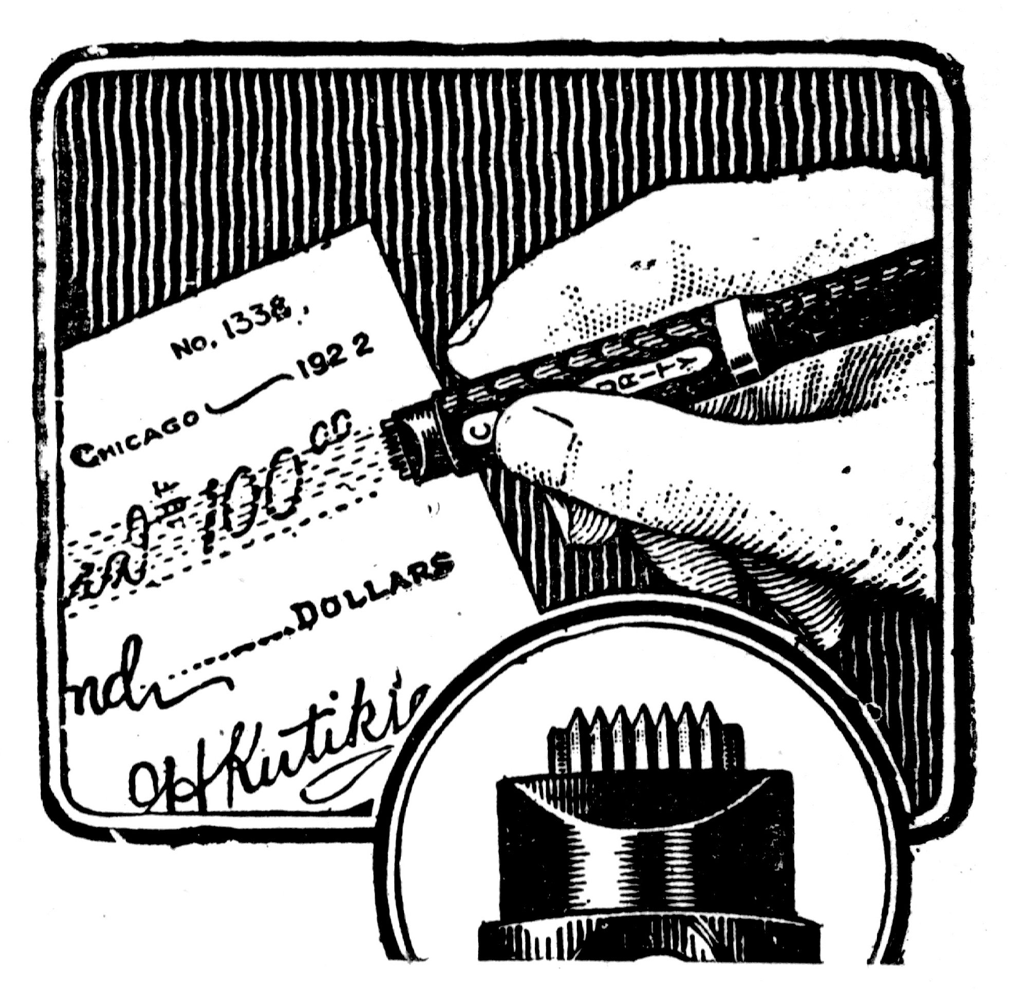
And the machine’s purpose is so narrow, so specialized it beggars belief. Hats? No, scratch that, hat bands? Even the aforementioned Early Office Museum made fun by calling it a “check protector imposter.” Well, joke’s on them, because you can use it on checks if you are just a bit creative:
Would Junior Initial Machine belong in my book? Hell no. Getting to explain its story would be even harder than explaining phototypesetting.
But it’s also great to share these peripheral devices. Part of my agenda for these recent newsletters is for those stories to now exist online, from the Keyport 717’s terrifying slab to the Canon Cat’s low-poly prototypes.
Maybe some years down the road, one of these will teach a lesson or inspire someone to remix an old idea into something new.
Or maybe it’ll just amuse someone, these quirky citizens of strange world of keyboards that seems to never want to end, telling us that the moment you move past “best” or “worst,” you get to encounter some really amazing stuff.

Marcin
This was newsletter №51 for Shift Happens, a book about keyboards. Read more in the archives