New in the collection, pt. 5: New Hermes NHI 810
I mentioned in the previous issue a rare two-and-a-half-thousand key Japanese typesetting keyboard that I learned was thrown away before I asked about it.
It was heartbreaking to learn that. But it’s even more heartbreaking to witness a photo of a rare keyboard in the moment of being destroyed.
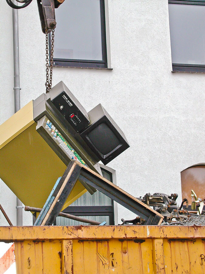

This above was a typesetting machine made by Berthold on the day of its unglamorous retirement.
Typesetting machines are perhaps the most fascinating part of keyboard history that I chose to skip in my already-too-large book.
After the arrival of Linotype (chapter 9), and before personal computers with their QWERTIES took over its job like they did with most other jobs, there was about a century of keyboards that was very interesting – but also simply too obscure, esoteric, confusing.
Even in histories of typesetting, this era is often rushed through. It would muddle the already-complex story, those machines that put photography and cathode ray tubes to exceedingly strange work, intersected with teletypes and word processors and typewriters and computers in peculiar ways, and threw around terms that always seemed to have one too many prefixes: photocomposition, phototypesetting, teletypesetting, supershifting, copyfitting, linecasting.
But we can talk about it now, and look at some fun keyboards.
⌘
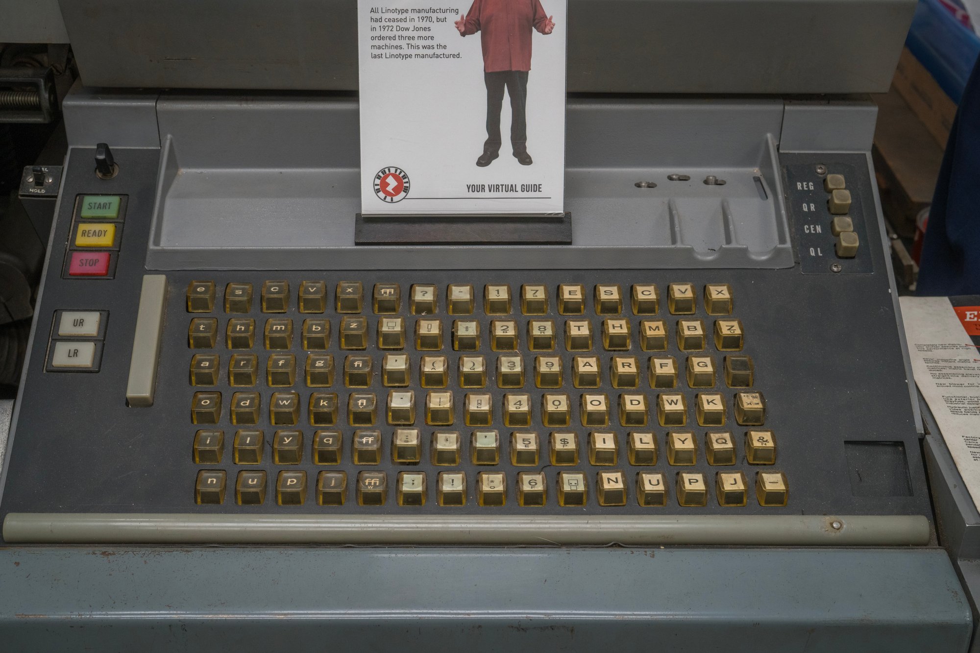
You might remember the endlessly quirky Linotype.
Monotype was its chief competitor, using a more modern system, and most importantly to us – sporting a QWERTY keyboard.
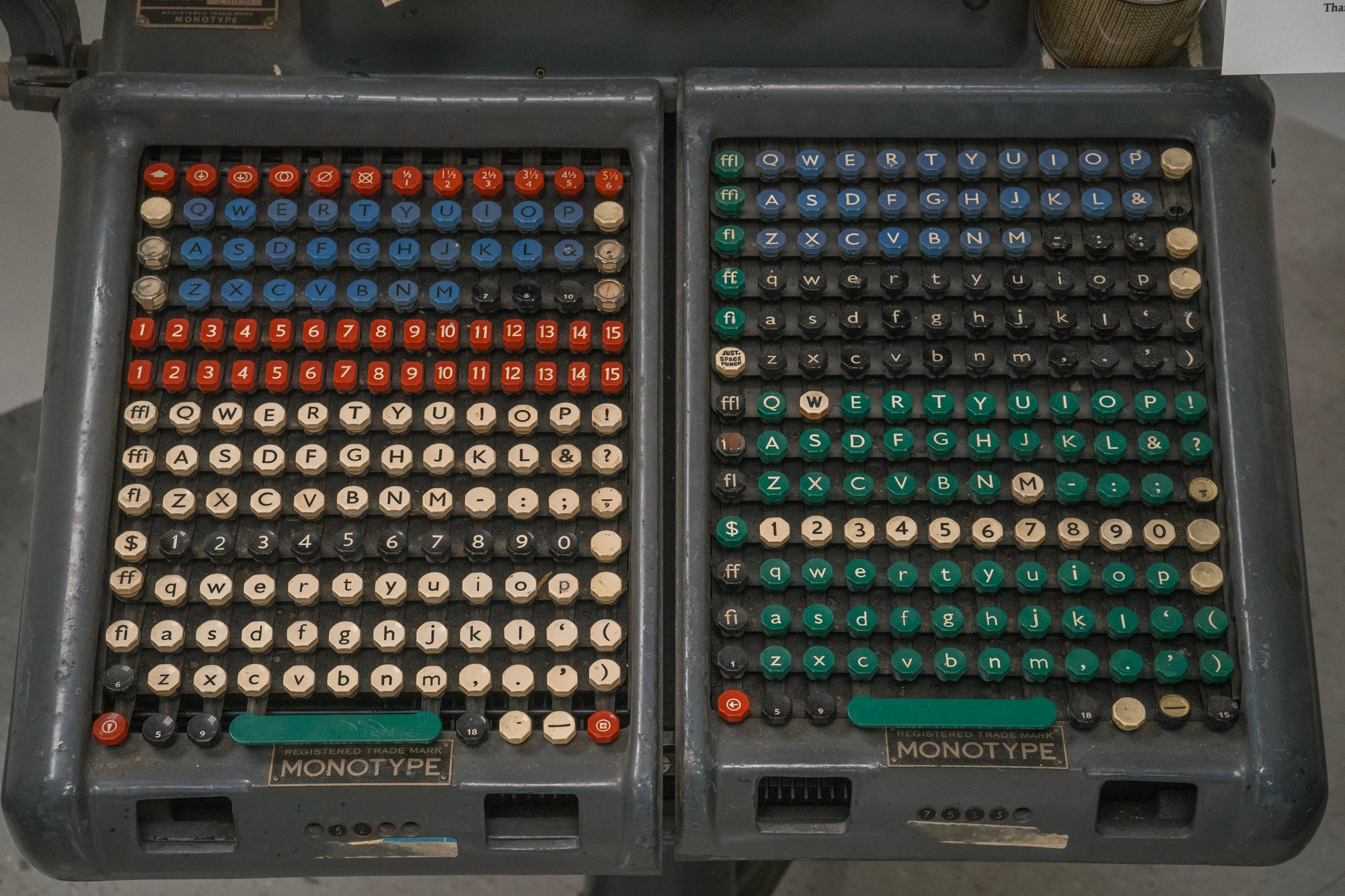
Or, should I say, QWERTY keyboards. Like Linotype, this was a shiftless system, so each set was repeated for uppercase, lowercase, small case, then three times again for italics, and sometimes even more.
The Linotype/Monotype rivalry was one for the ages, right next to VHS and Beta, or iOS and Android. “Think of Monotype vs. Linotype as the Depression-era Mac vs. Windows,” quipped a modern typographer.
Newspaper bought the Linotypes and dreamt of the quality of the Mono. Fine-book plants used Monotype and envied the speed of the Lino. Monotype was more versatile, but Linotype was cheaper. Lino got shit done before lunch; Mono took forever, but kerned like God was watching.
If you’re wondering why there are so many Garamond fonts around, or why there is a Times Roman and a Times New Roman, it’s all a side effect of that decades-long fight.
As you might expect, at the last of those decades, the keyboards were all but grown up, dropping most of their 19th-century industrial clothing.
⌘
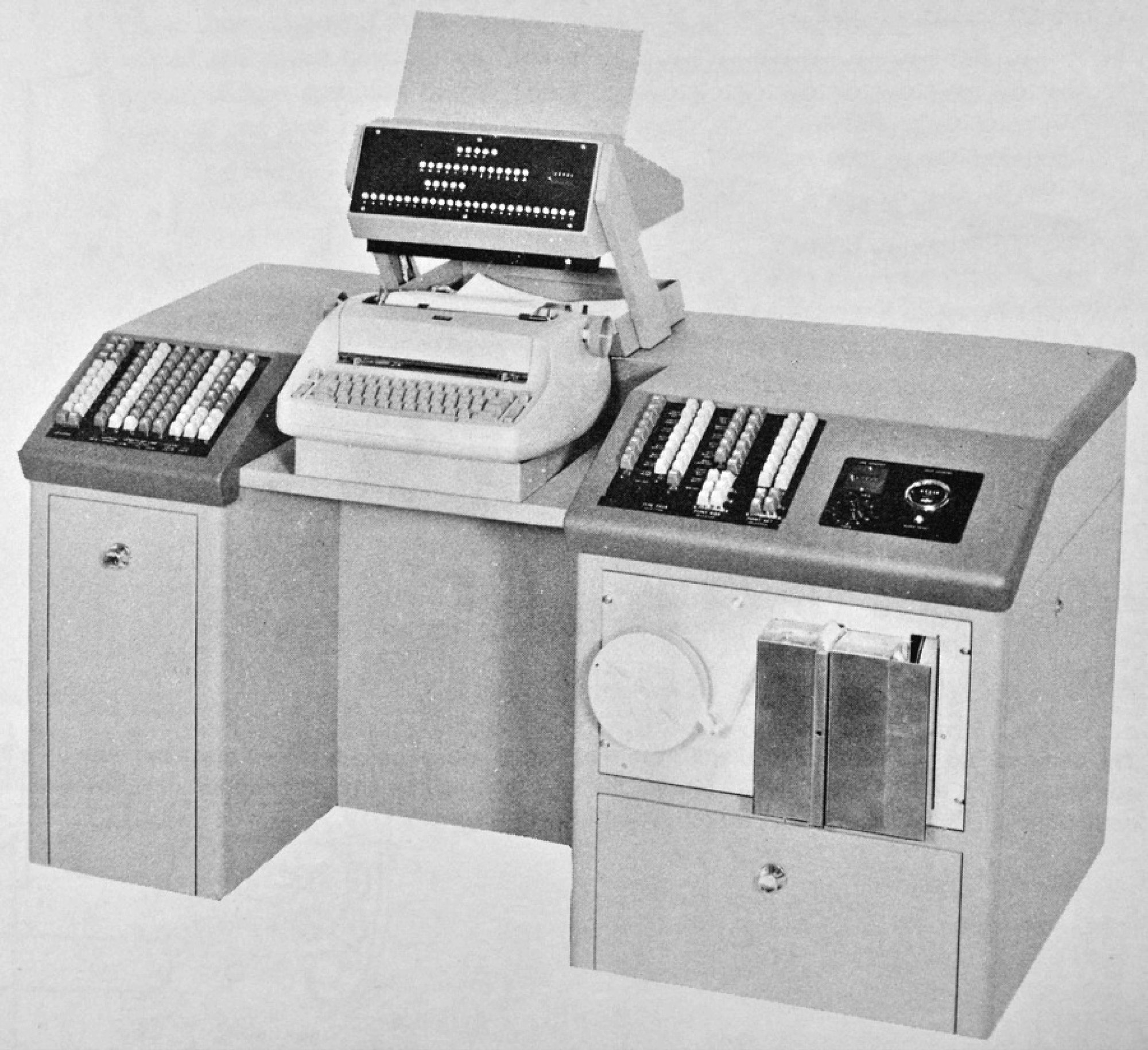
But let’s not jump to computers too soon. Next to Linotype and Monotype, there were tons – literal metric tons – of other machines too, from simple typewriter-like typesetters, to more sophisticated systems.
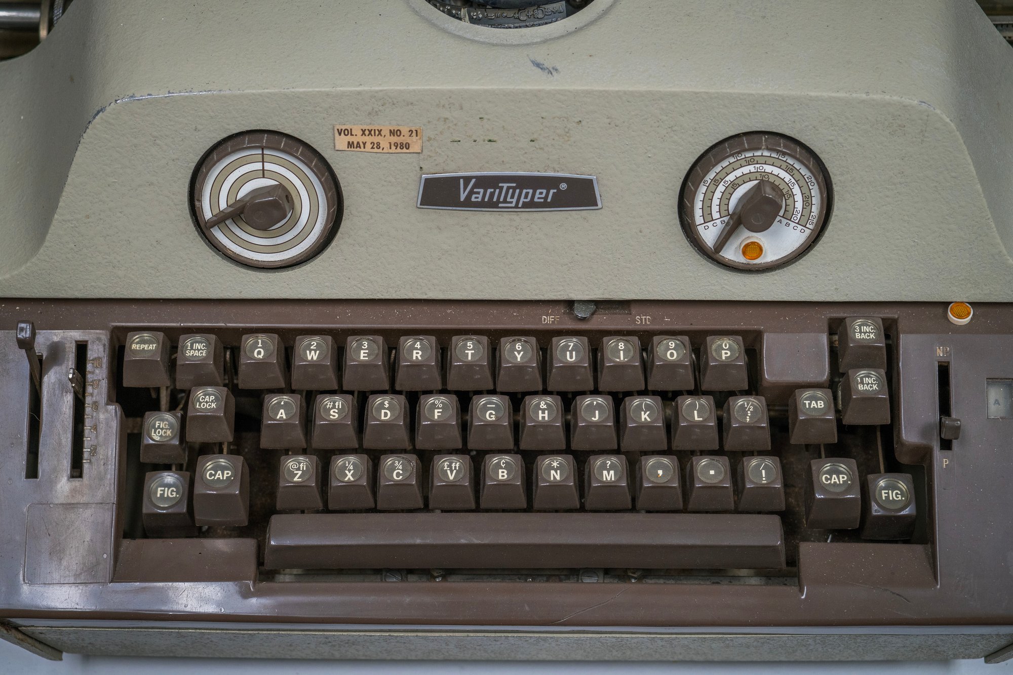


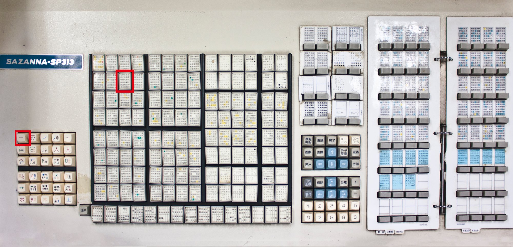
In this series whose theme seems to rapidly approach every road leads to Japan, I also have to mention a Japanese typesetting Sazanna keyboard with a whopping 30 shifts, and a page-turning interface next to them.

⌘
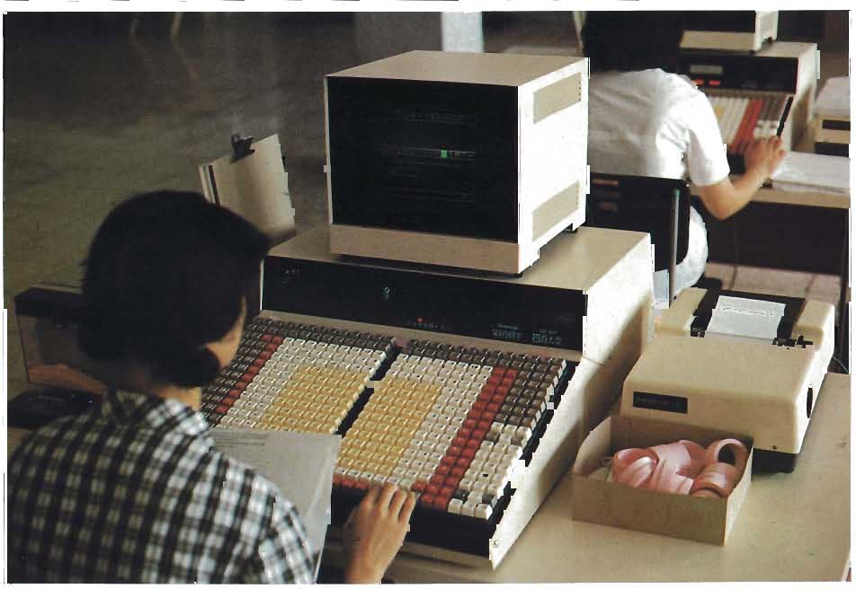
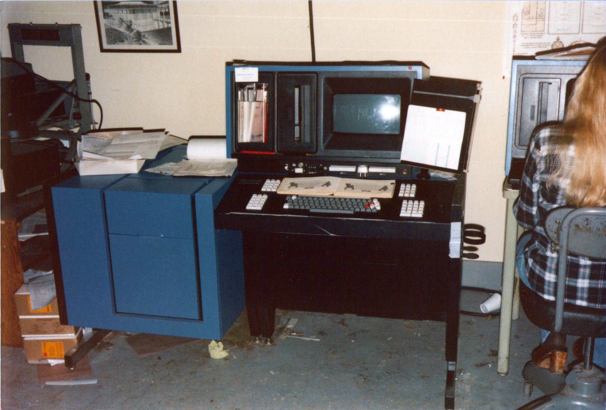
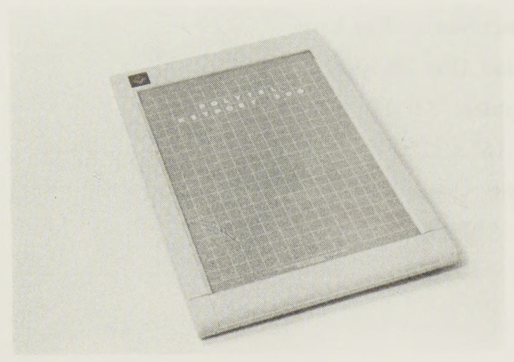
Eventually, screens started appearing, although initially so comically small they sometimes showed as few as 8 characters:

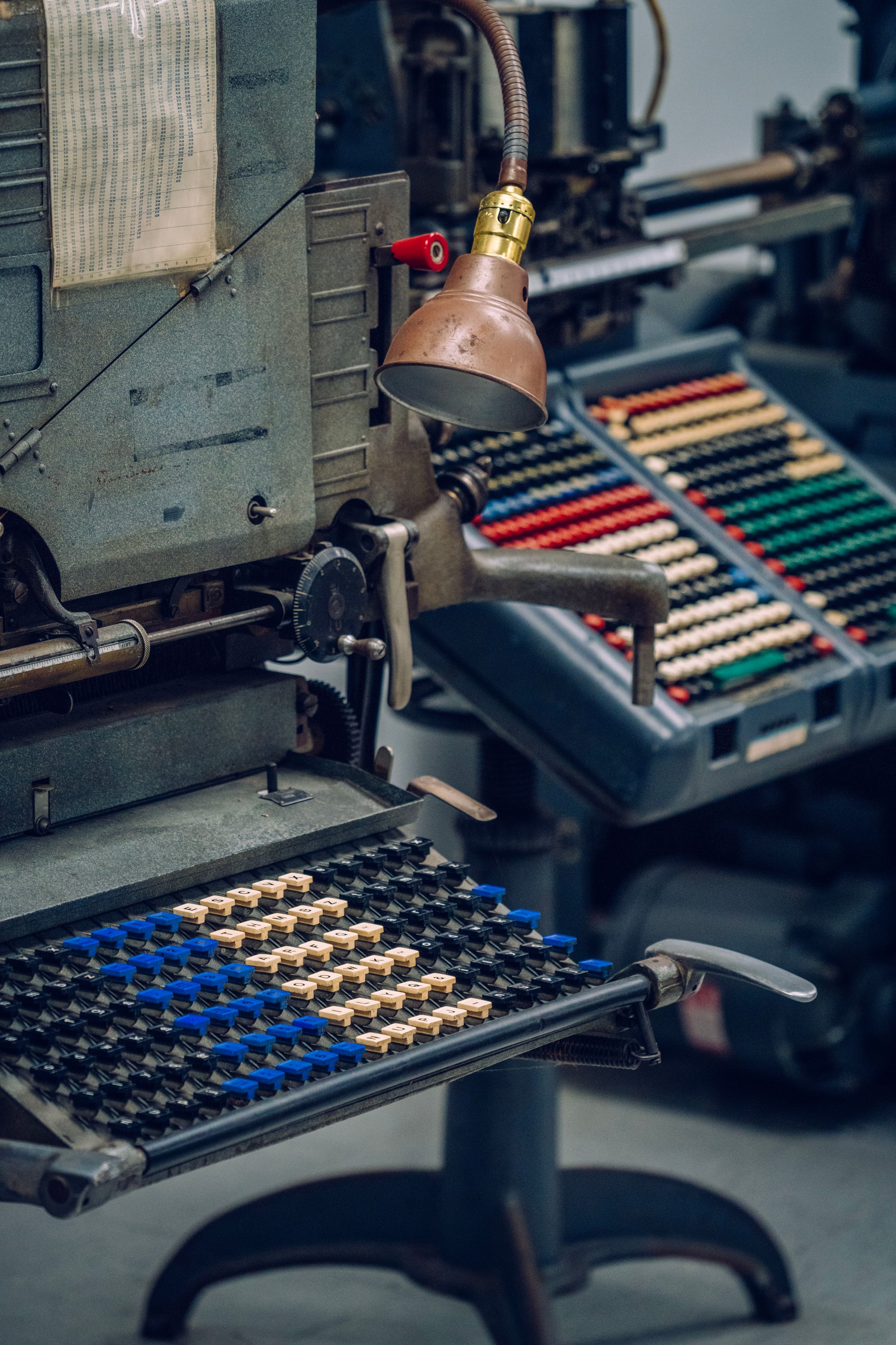
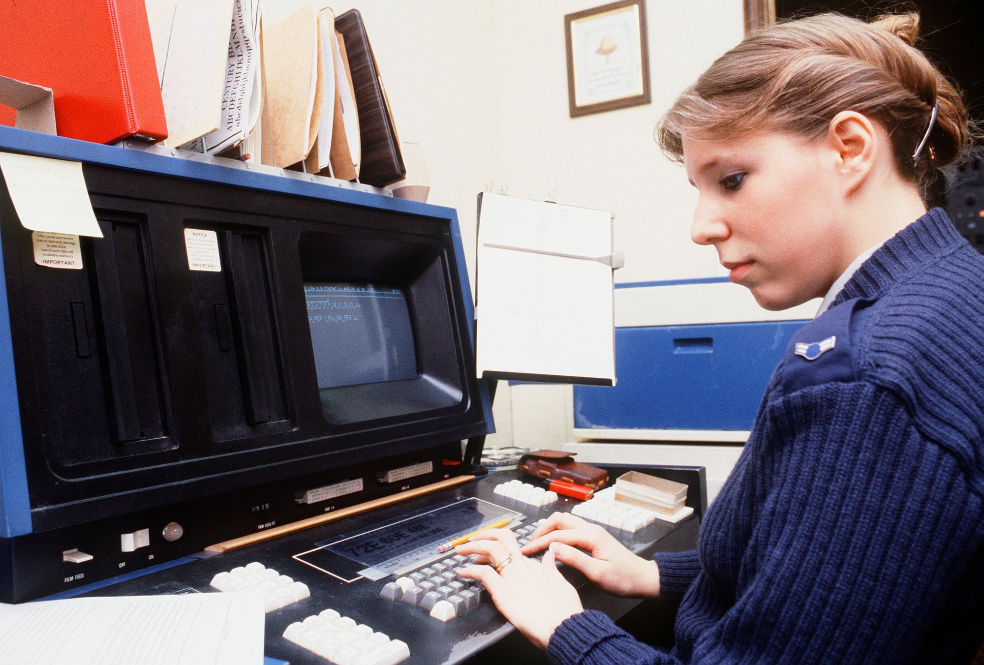
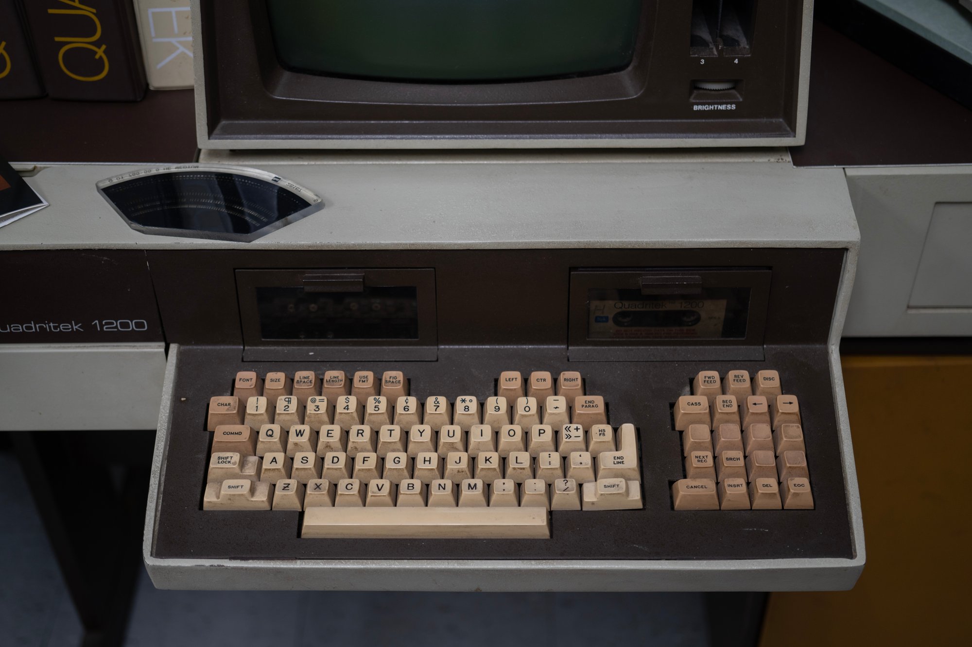
Today, all these machines are strange to look at, with huge copyholders in place where we expect displays to go, and the screens themselves, cash-register-sized, only somewhere in the periphery.
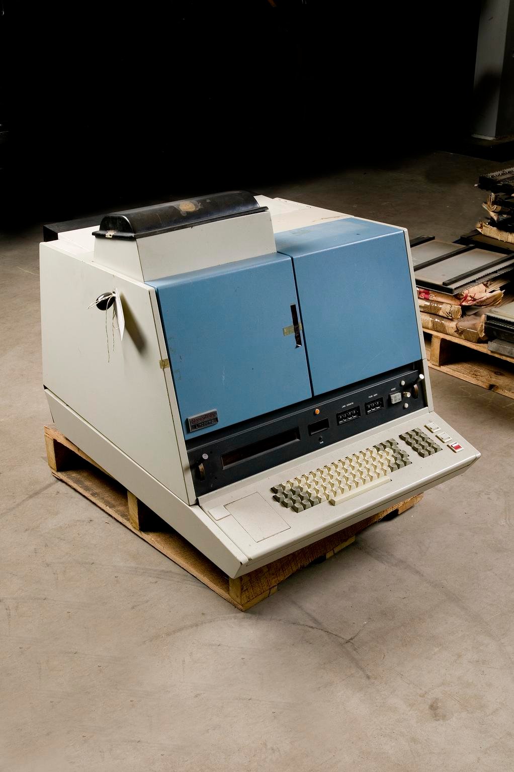
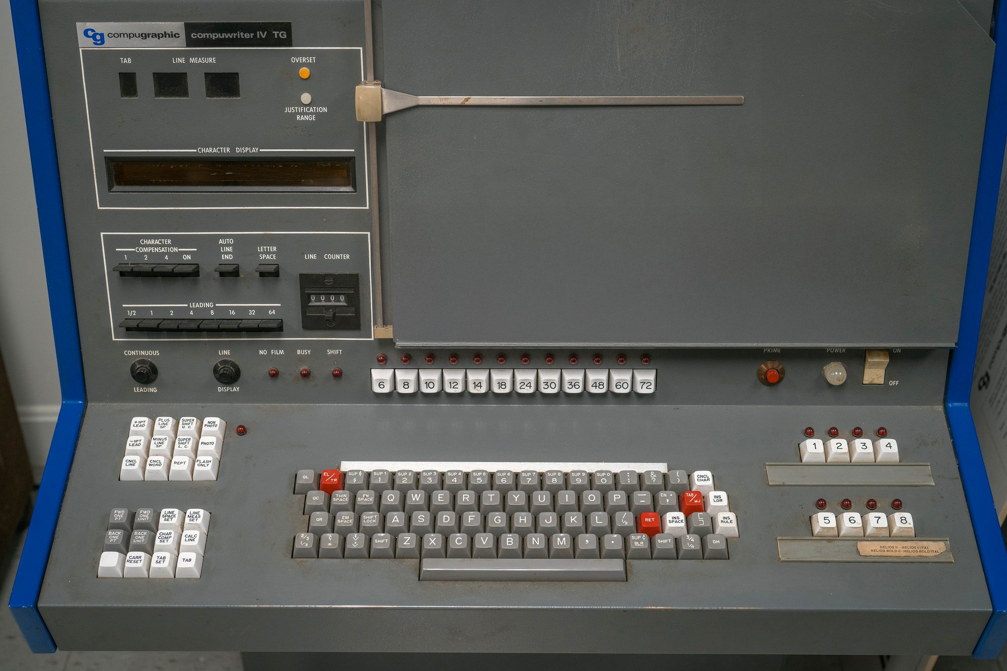
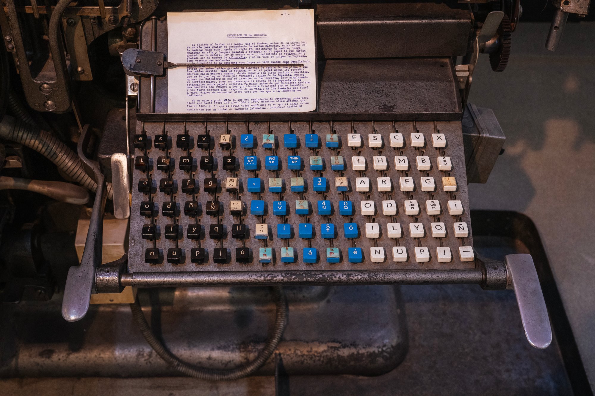
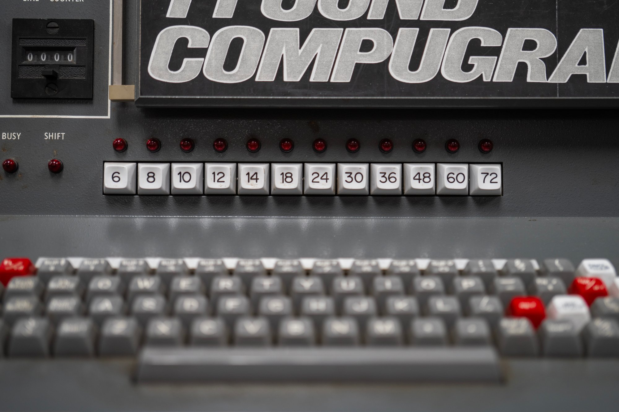
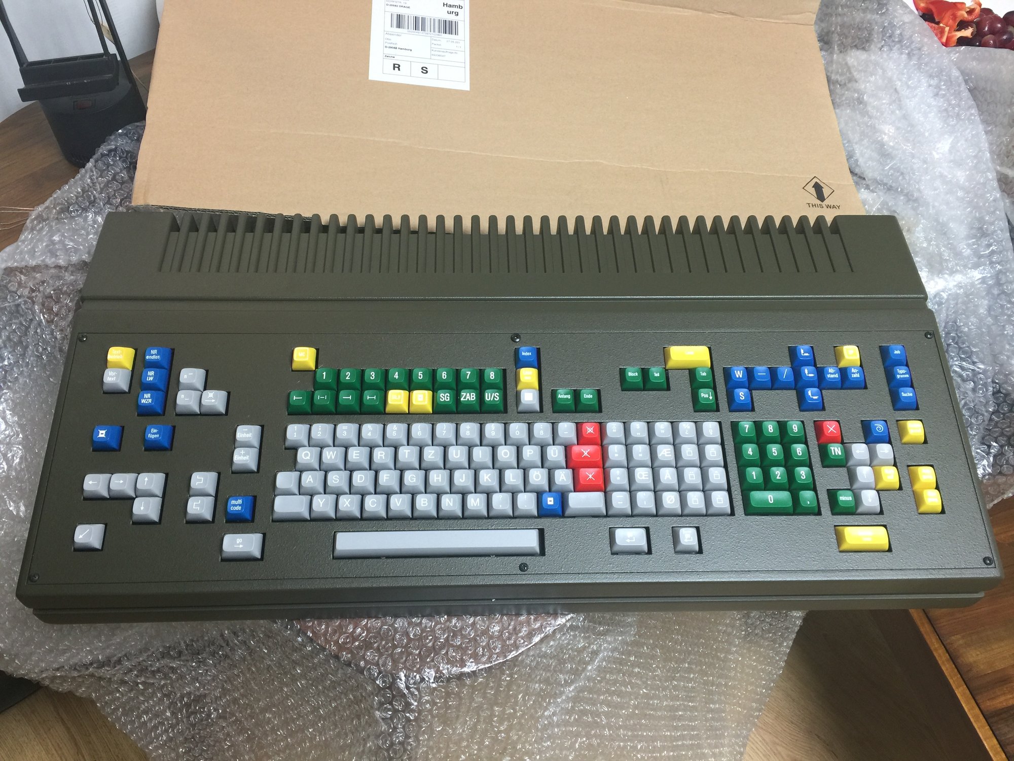
Partly as a result of the lack of pixels to convey information, and partly because they never shied away from extra keys, most of these machines developed a keeper mentality toward their keyboards, with even features like individual font sizes or font types having dedicated buttons.
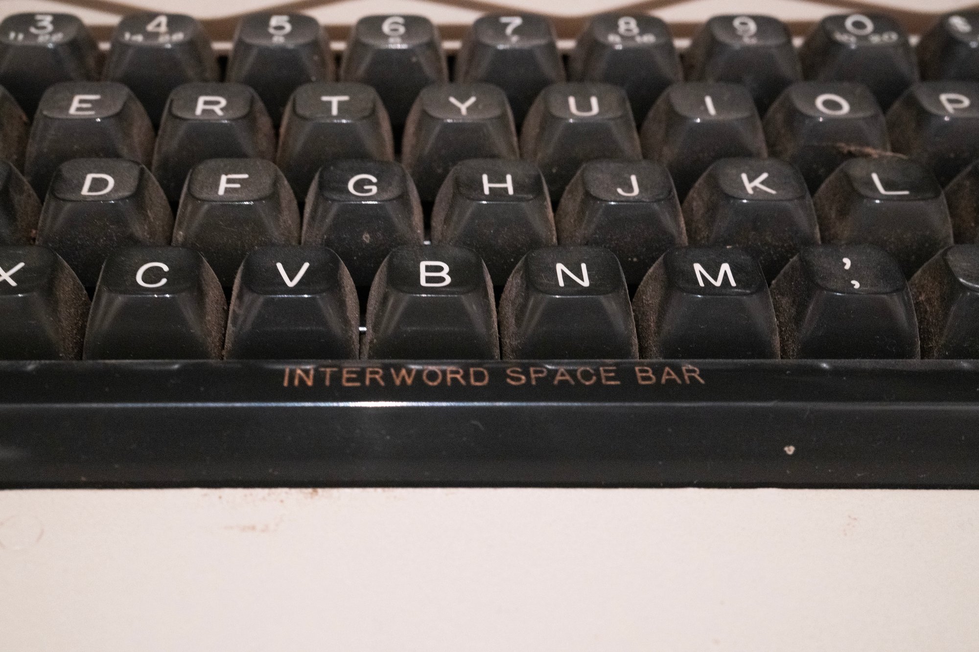
A lot of Gorton appears here, somewhat ironically since Gorton is not a very “typographical” typeface. The one below might be my favourite, beautiful orange keys with typography conventions – hyphens and contractions – rarely seen elsewhere:


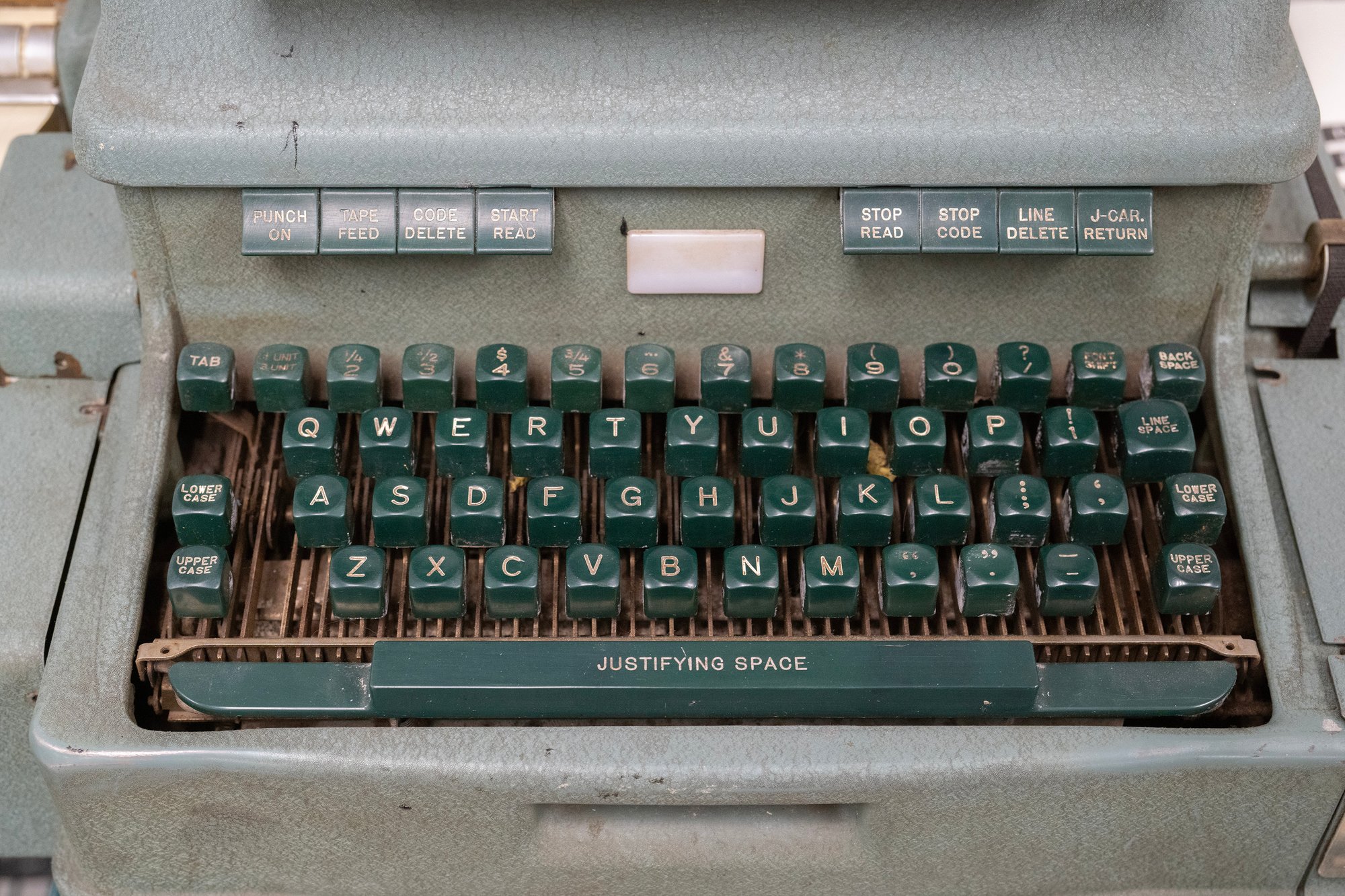
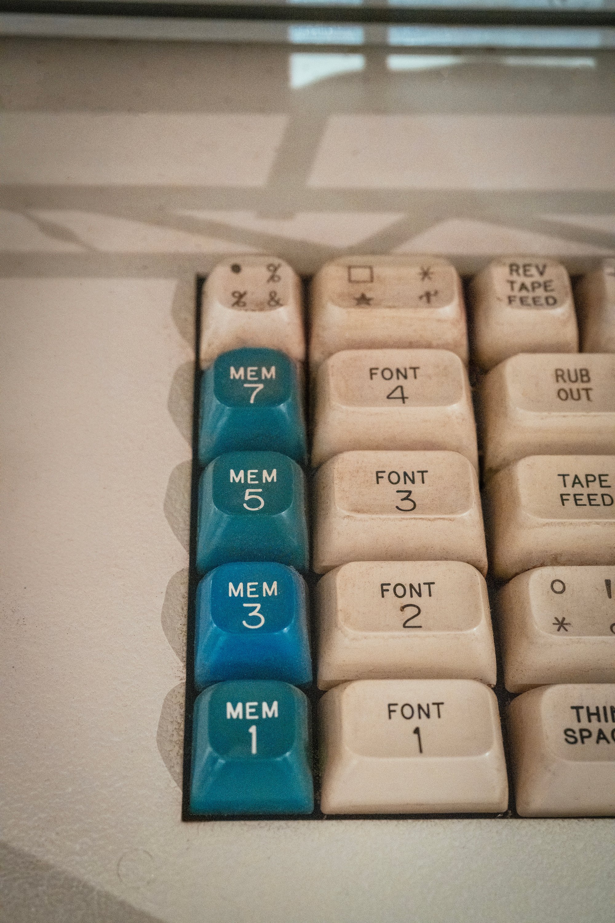
The legends are generally all fascinating; if typography is already filled with strange words – please don’t ask me about “orphans” and “widows” and “bastard type” – then typesetting layers even more alien stuff atop, with various extremely specialized keyboards (counting keyboards, perforating keyboards, blind keyboards) talking about center quadding and H&J (hyphenation and justification), sporting pairs of keys for each quotation mark, and seemingly infinite keys for the infinite flavors of spaces.
⌘
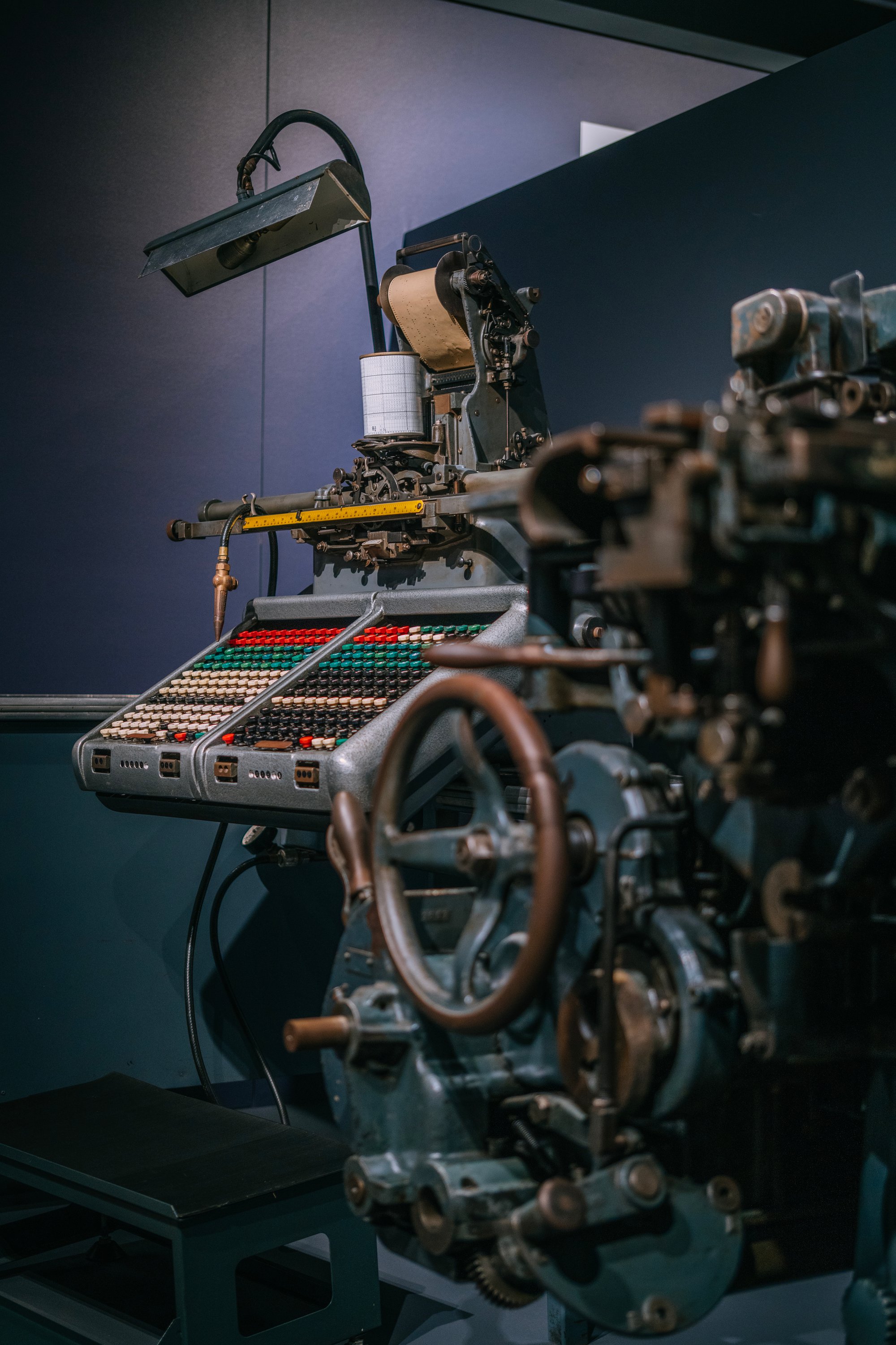
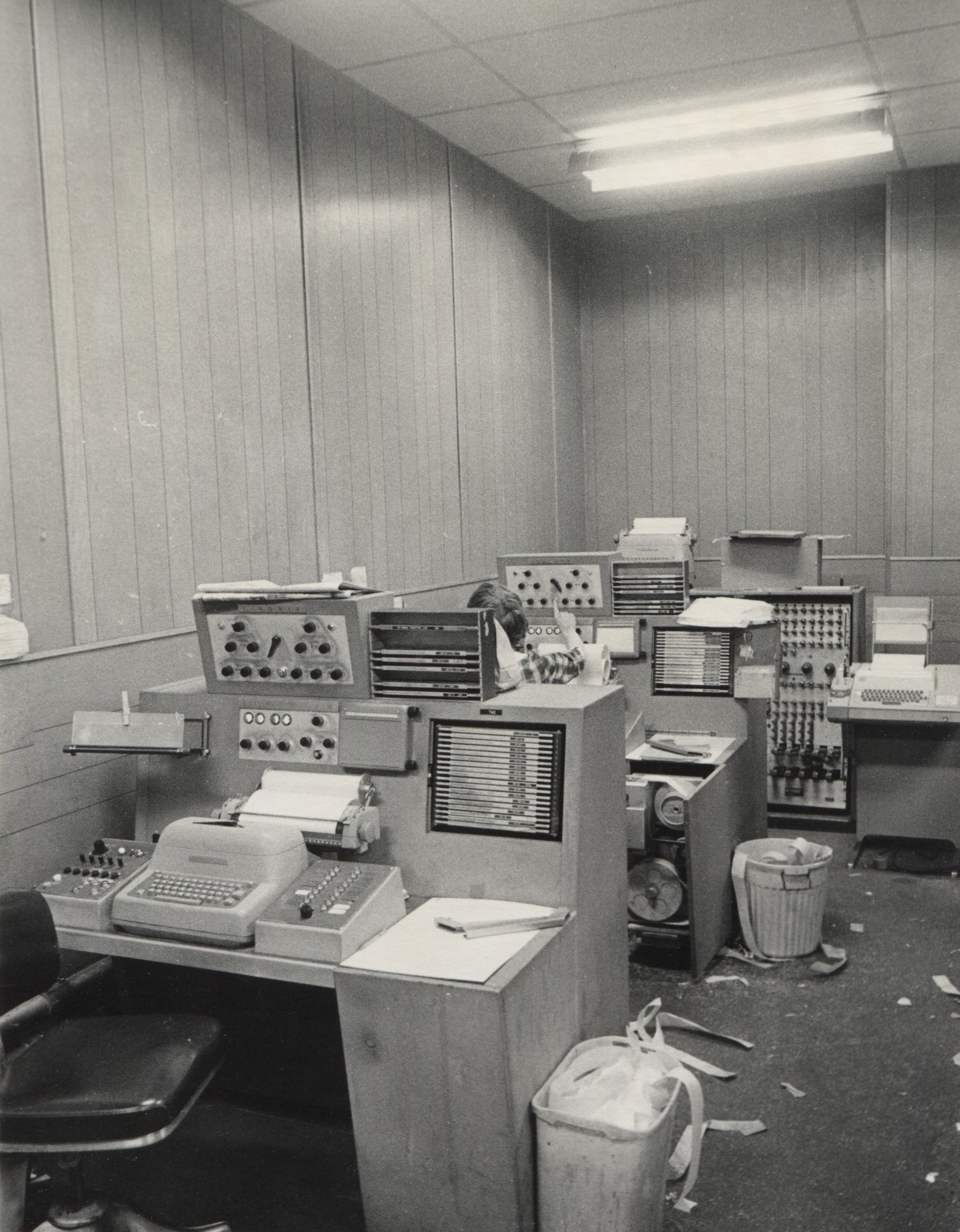
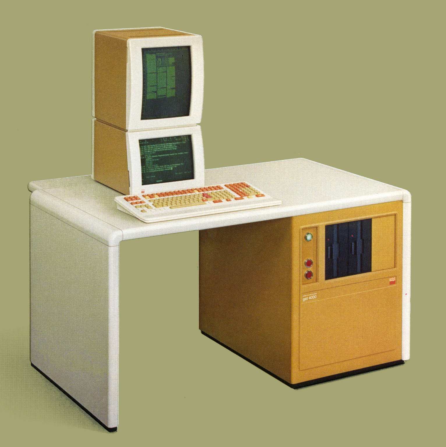
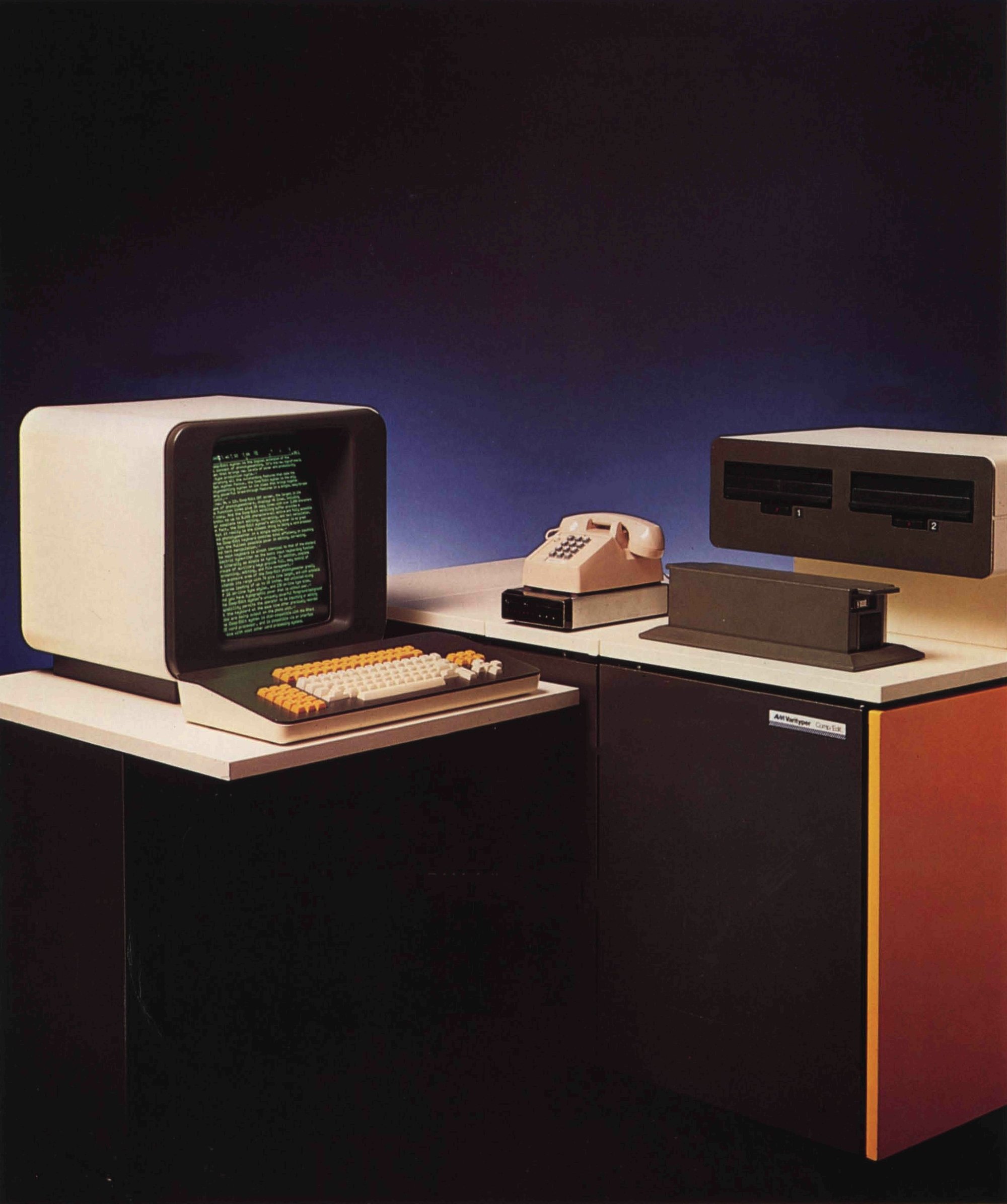
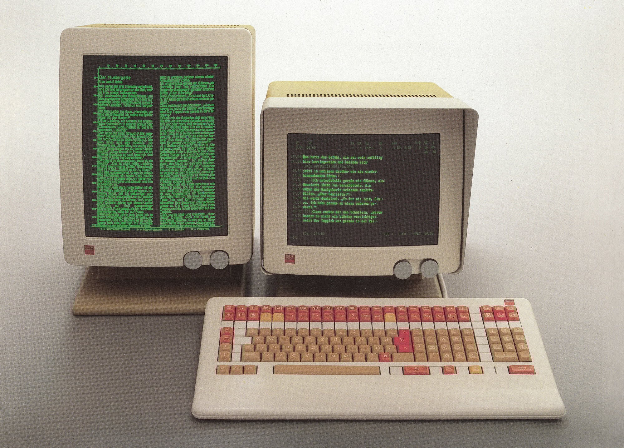
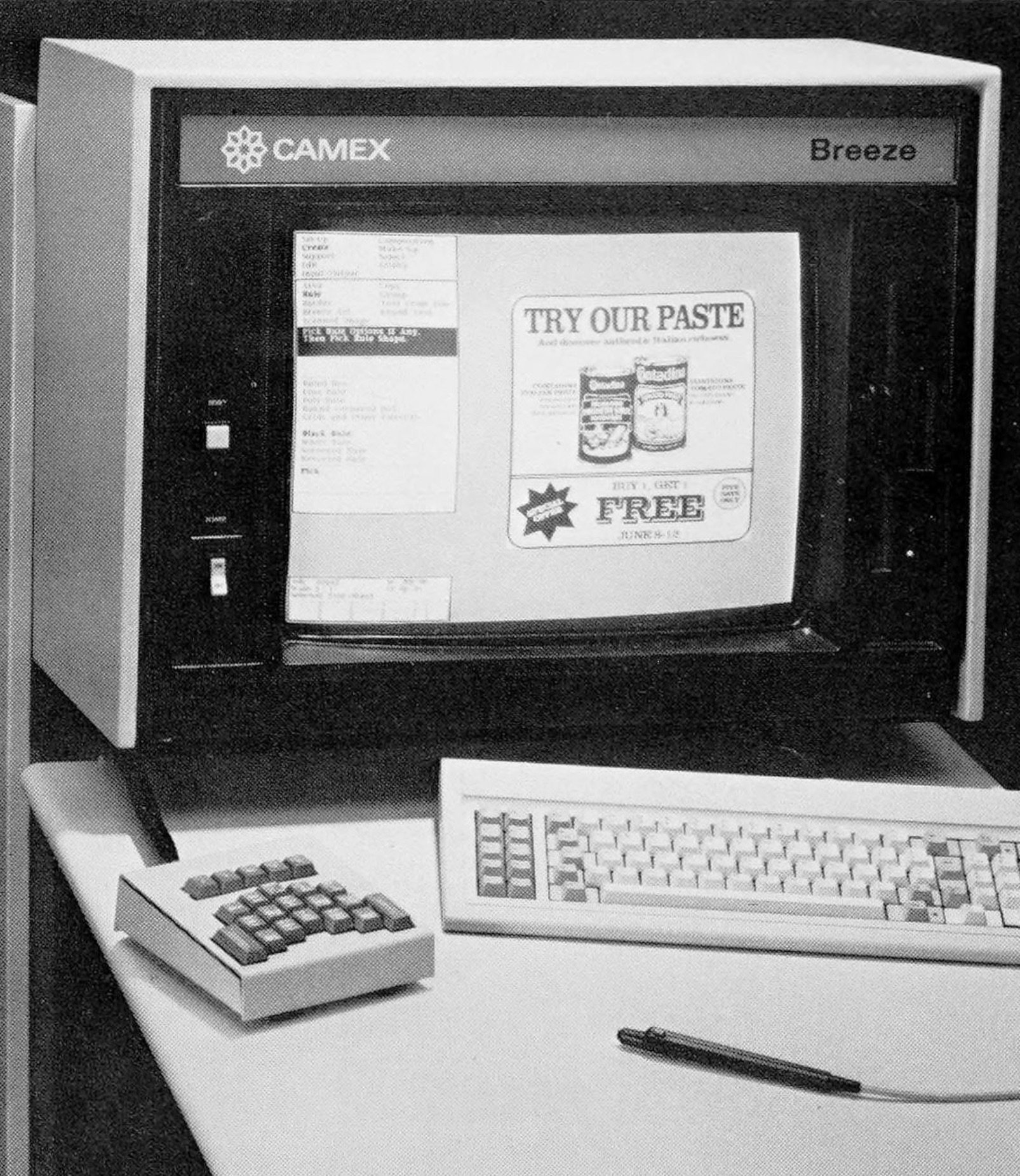
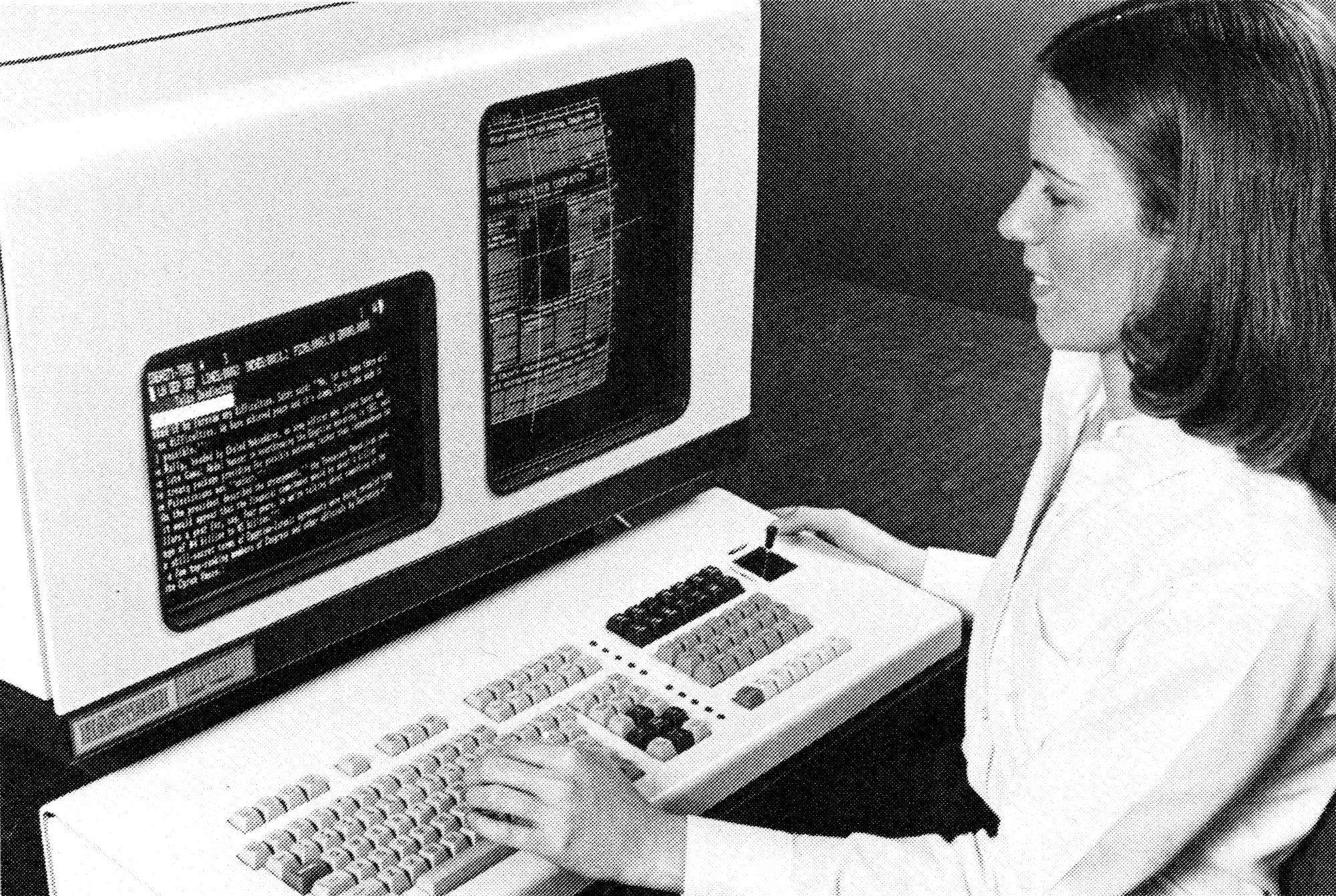
As screens became cheaper, the screen-to-keyboard ratio started resembling what we’re used to.
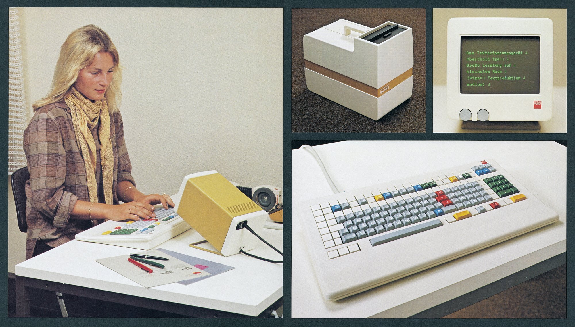
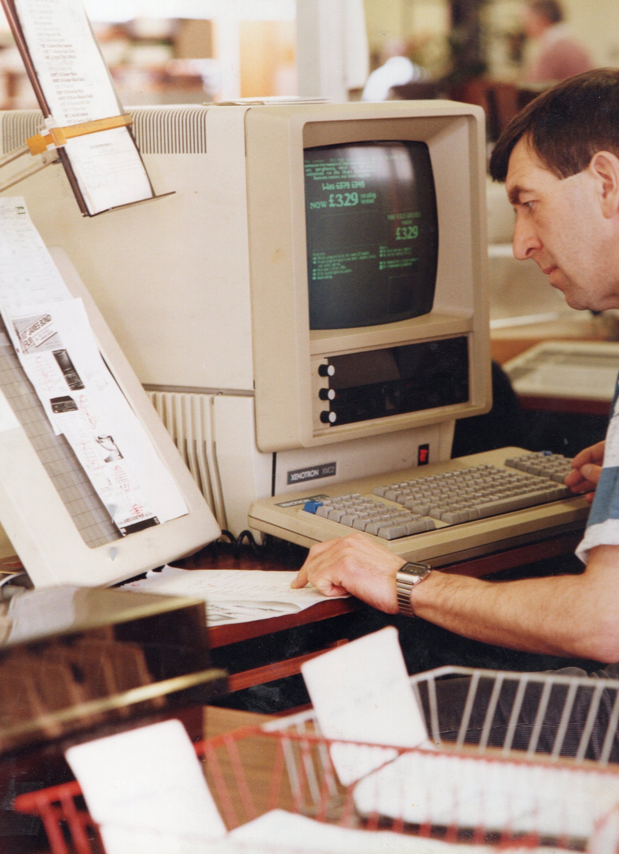


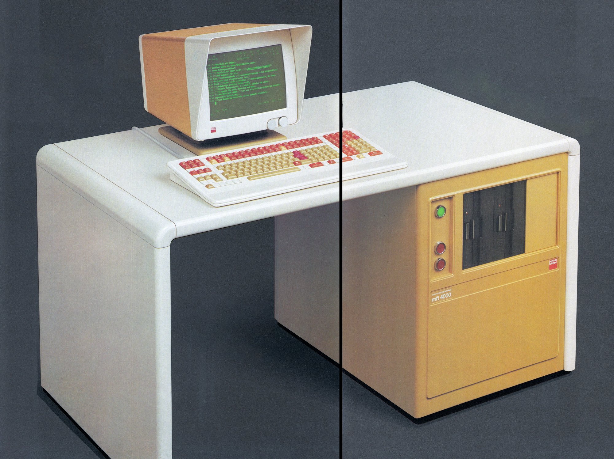

But then, the screens never really stopped, and many typesetters started showing up with at least two: one for input, and one for WYSIWYG preview.

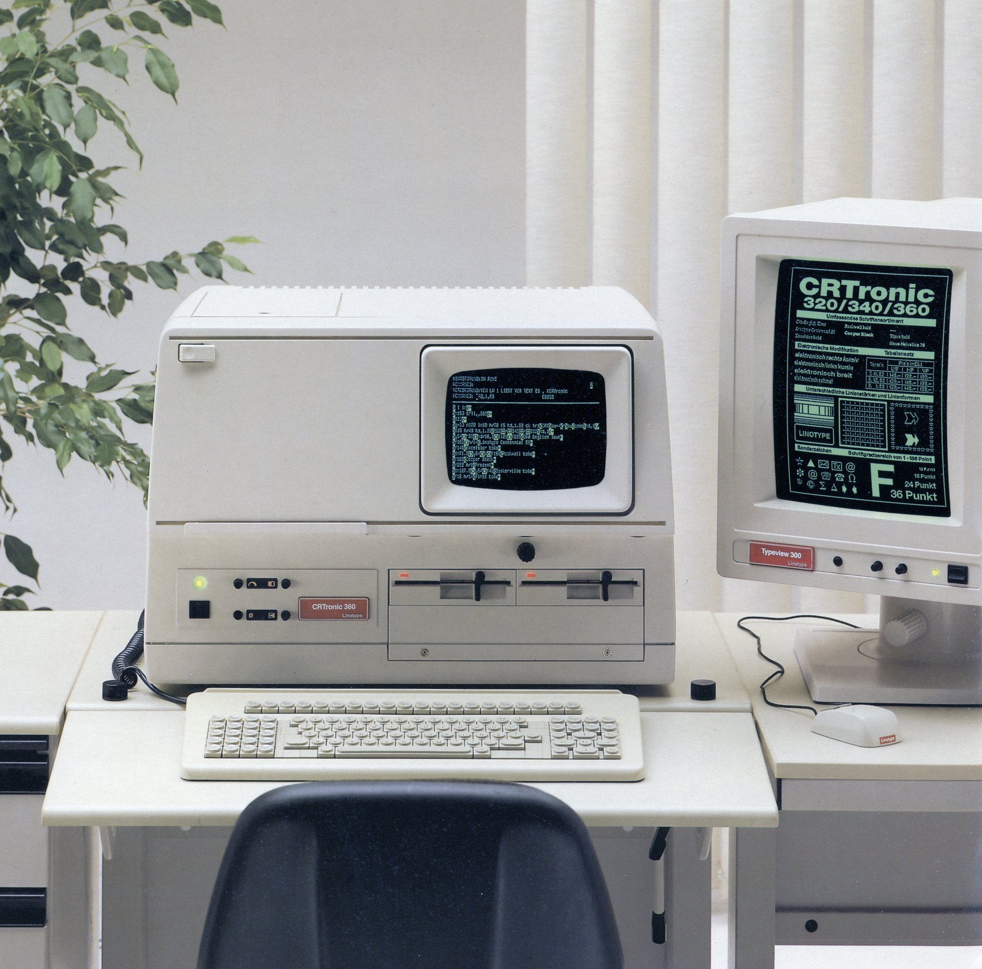
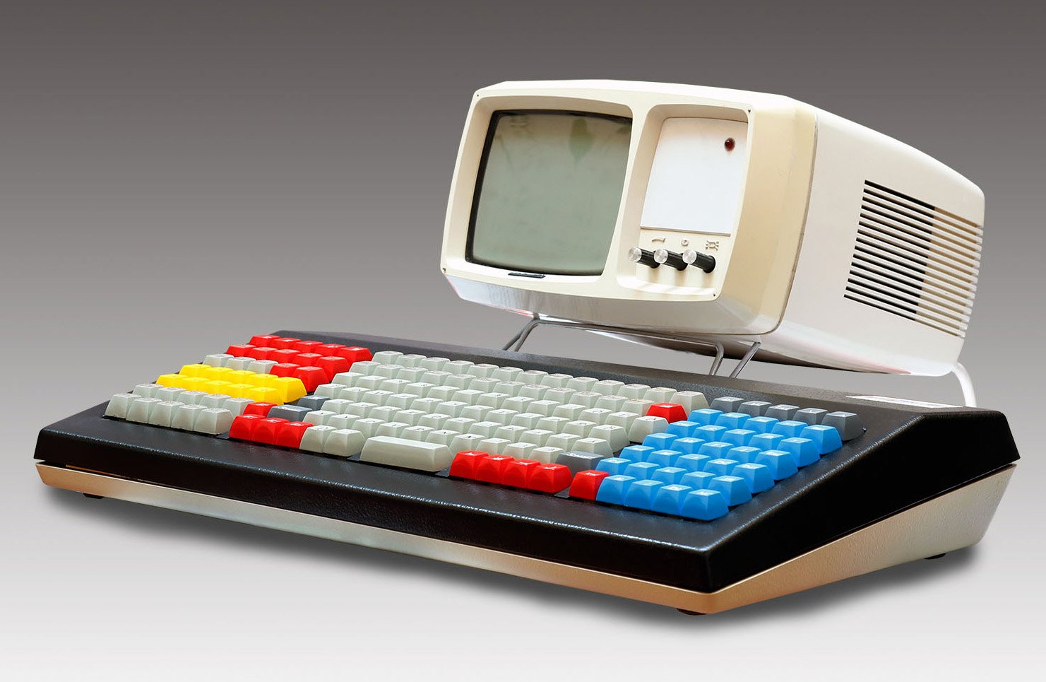
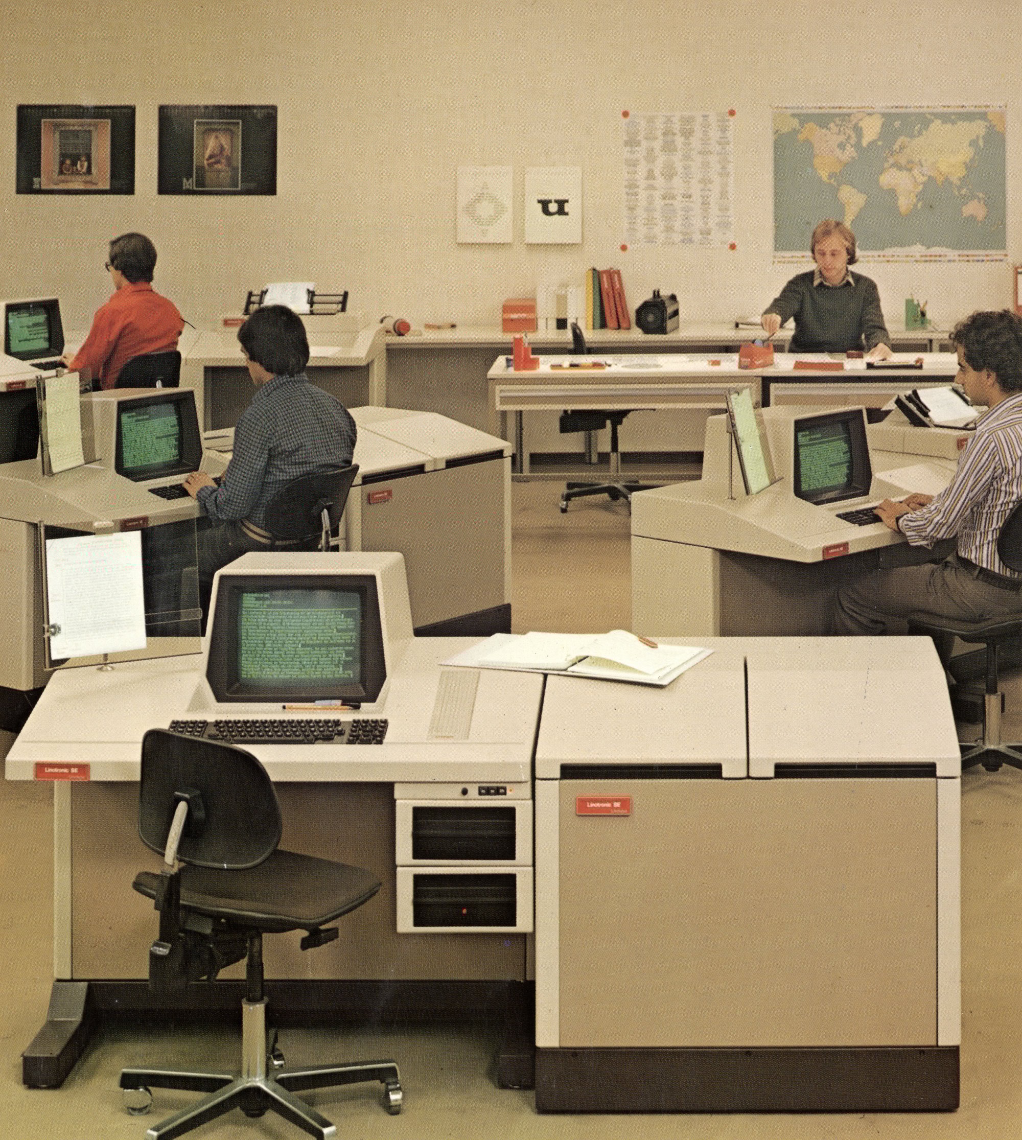
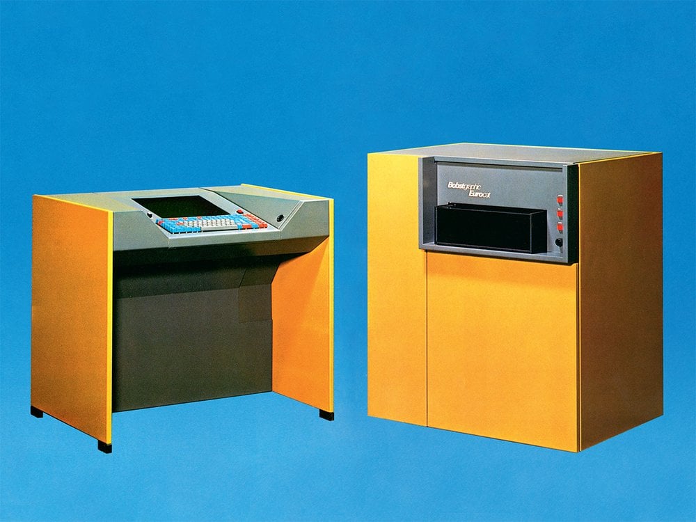
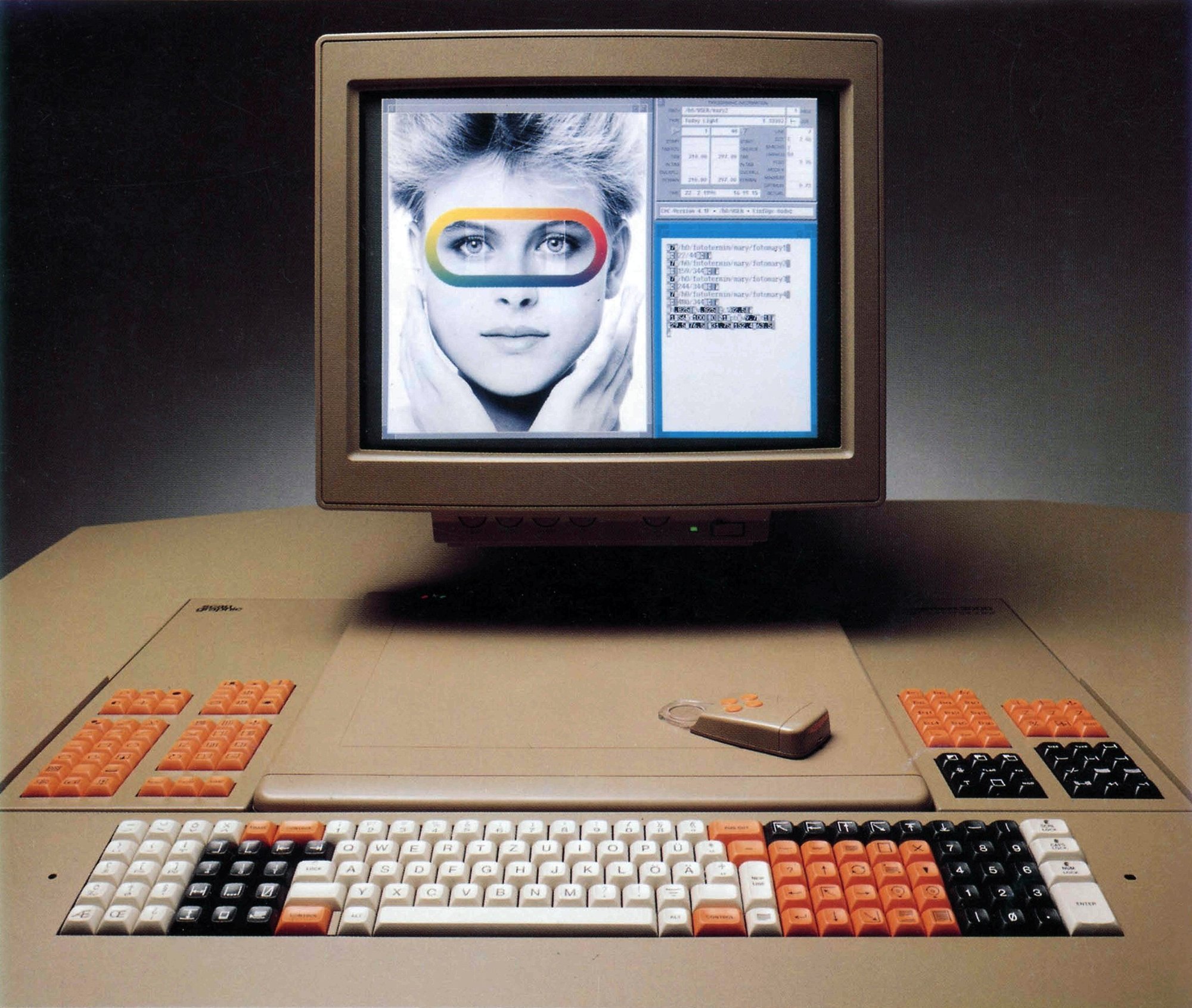
Many of those machines were always “high tech,” and high tech ages in perhaps the most peculiar ways; for example, I absolutely adore the styling of the above CRTtronic… and I feel similarly about the below European system that exchanged jargon legends for equally bewildering iconography.
⌘
I have learned a lot about keyboards in the last decade, but put a digitizer’s reticle to my forehead, and I still won’t be able to tell you what most of these keys do – even the Aesthedes (playing roughly at the same arena) felt less opaque.
This whole space feels like this. Just like when dealing with Japanese word processors, I’m jumping around mouth agape, understanding only snippets, and reducing the entire story to “screens getting bigger and bigger.”
I apologize for that. If you want to dive deeper, a historian of this space, Frank Romano, published a few books, and I scanned a few by John W. Seybold, chronicling the industry as it was happening, at a speed of one per decade.
I read a lot of these, but it’s all still very alien to me – and it’s all disappearing fast.
The Canon Cat prototypes I have are not exceedingly rare – a few other places have them as well. But as everyone knows from algebra, the distance from 3 to 2 is smaller than a distance from 2 to 1, and infinitely smaller than the distance between 1 and 0.
Most of the typesetting machines are at zero. They’re gone gone. If you hear of a typesetting shop operating today, it’s likely hand-set letterpress, which came before the Linotype. Some museums have Lino and Mono machines, sometimes in working condition. Only rare places, truly few and far between – here’s Mr. Romano again – have other types of typesetters.
The truth is that half of the photos above were not preserved machines, but scanned brochures. A lot of machines don’t even have that, reduced to just one ugly photo in an old book, their key legends now forever undecipherable:
And even those are still generally well-known machines. The other ones? They survive only as a bullet on a hardware list in a magazine from decades ago, and isolated memories of an increasingly smaller pool of people.
The typesetters were priced like houses, with keyboards alone probably costing a small fortune. There aren’t any emulators because no one would want to use them – and shared nostalgia to prop up preservation and emulation efforts hardly ever reaches critical mass.
The enormity of what we lost, that original photo now multiplied by a hundred products, sometimes feels unbearable. Words mean a lot to me, and this is how words spread before the internet, for a whole century. And we might owe HTML to these machines, which first explored and perfected the very idea of markup.
At least that first Berthold keyboard was preserved. An exemplar pops up time and again in a random keyboard collector’s post, their mouth as agape as mine tends to be, registering it as a curiosity, a more exotic Space Cadet. But I don’t know if any of them have a good understanding what those keys were used for, and what they really meant.
⌘
I don’t have the Berthold keyboard, nor did I pull a trigger on getting a typesetting machine, even though they show up on eBay from time to time. But this series was supposed to be about my collection, wasn’t it?
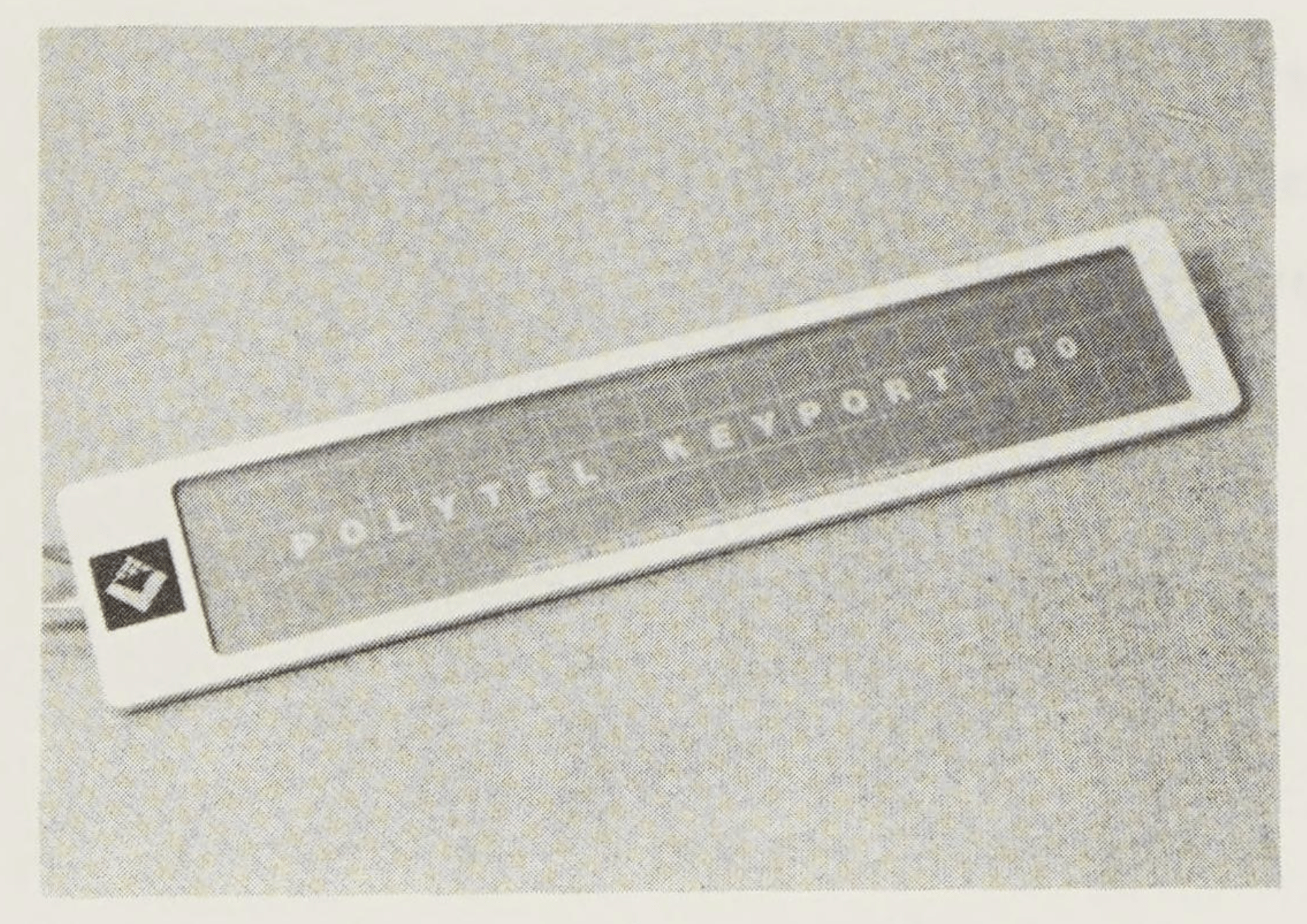
Seeing the enormity of some of the keyboards above, it might not surprise you that the oversized Keyport 717 was also pitched for typesetting.
(It also won’t surprise you, in this series whose theme seems to rapidly approach there is never just one of anything, that there were also Keyports 60, 176, and 300, as the company rebooted the series trying to salvage their idea.
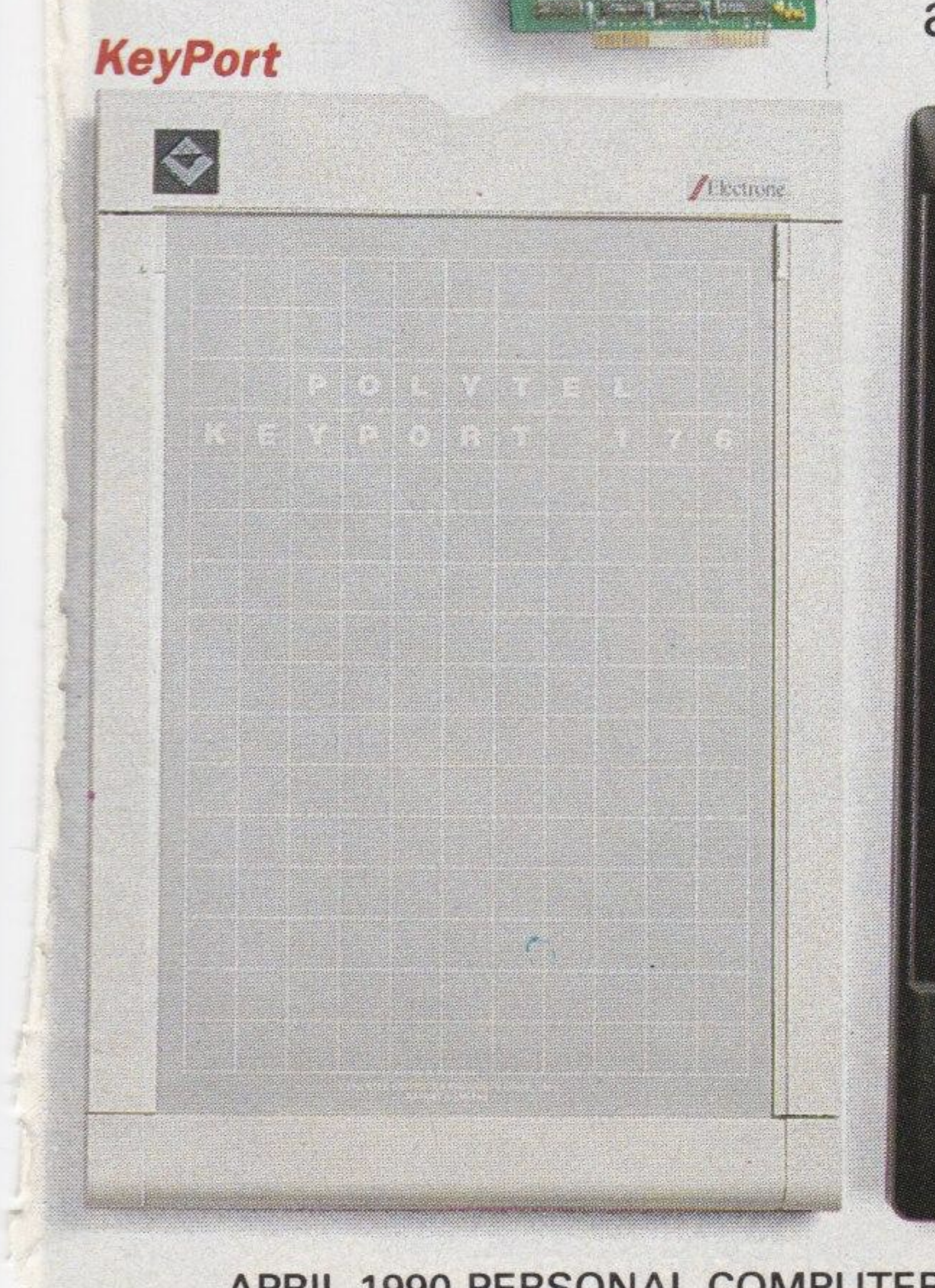
Not sure if that worked well. “As an office worker, I would be content if the Keyport 300 in its present form would crawl back into the black lagoon from which it emerged.” Ouch!)
But Keyport 717 already got its entry, and I didn’t get any new Keyports in the days since I posted about it.
No, this post is about a new machine altogether.
⌘
Printing is fascinating. But ever since I started exploring the history of Gorton, I have encountered a smaller, parallel world of engraving.
That world charted a path similar to printing. You could engrave by hand, which is roughly analogous to handwriting or lettering:
You could get “movable type” and use that instead:
Or, later on, you could actually purchase a typesetting machine to do it all for you. The machines too started room-sized…
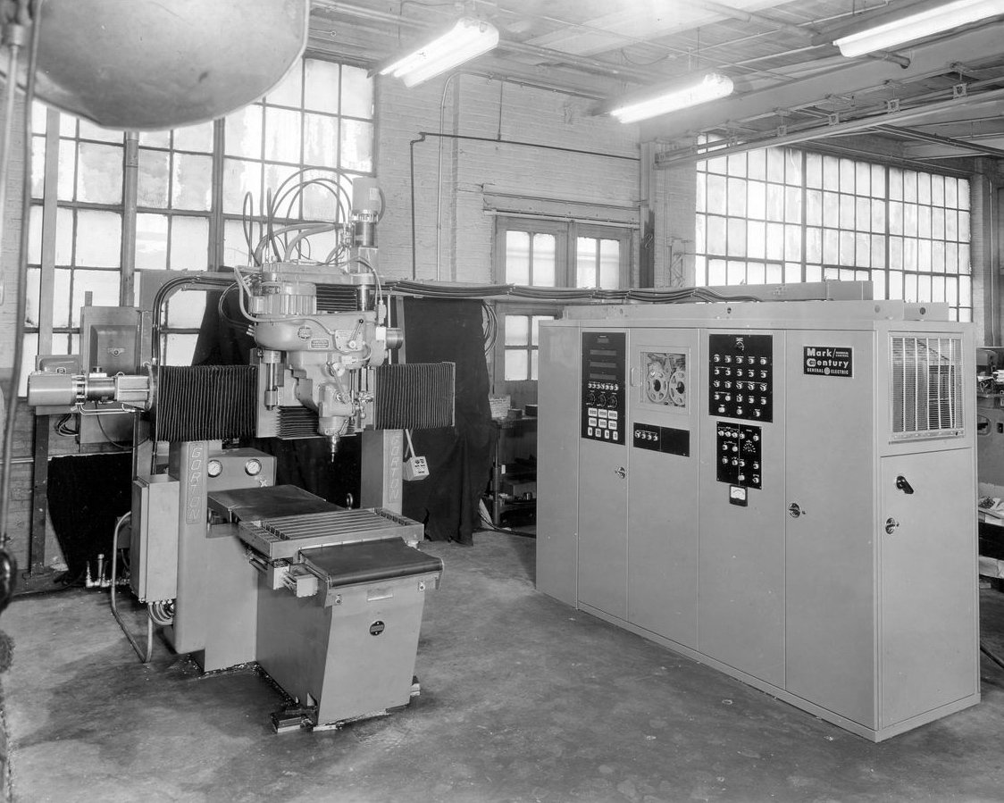
…but over the decades, in a now-familiar story, they received screens and shrank themselves enough to arrive on our desk tops.
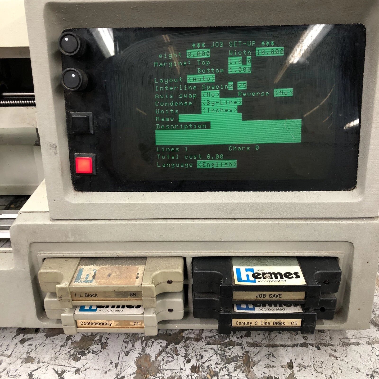
I haven’t found a lot of info on these machines, but the one that kept popping up was a computerized engraver named New Hermes NHI 810:
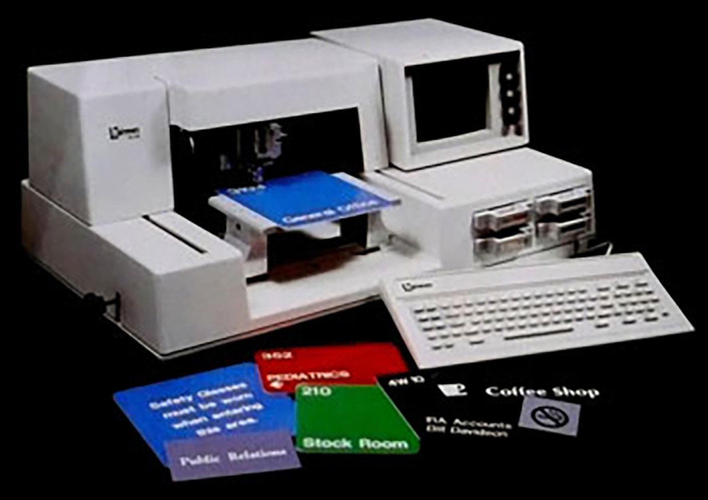

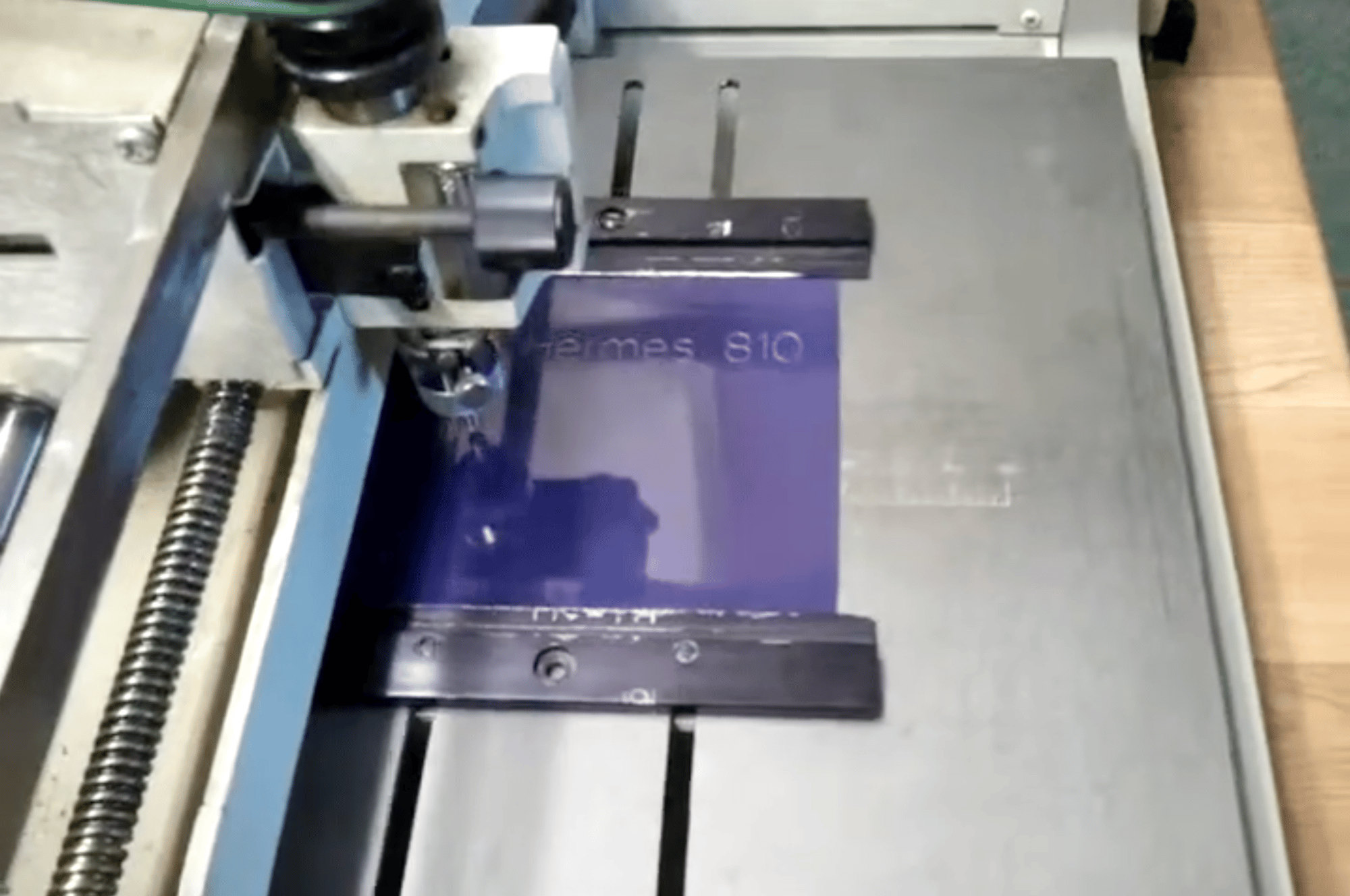
It’s a very particular typesetter, a periphery of a niche hiding within a fringe, and appropriately endangered. You can watch the engraver in action, although that video itself is also rather old. The machine might register as a cousin to the Max Cadliner I showed at the bottom of one of my Kickstarter updates – down to similar sounds of servomotors – which immediately highlights how tricky it is to even start talking about this whole space.
Although my finger has been spotted hovering over some blue eBay buttons, I didn’t get the New Hermes machine, as even a small beast like this would be too much for me. But I have one of its fonts that came in a cartridge (it’s a version of Gorton, of course)…

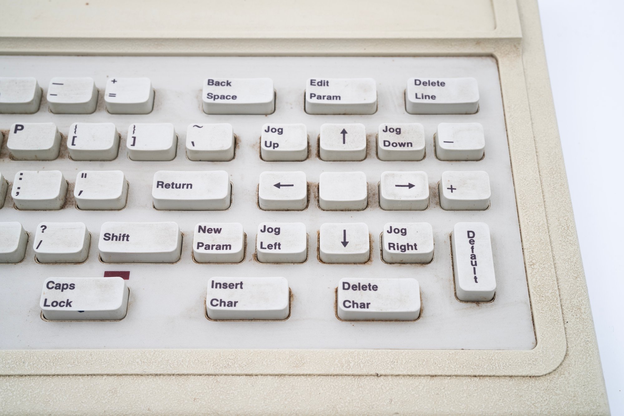
…and I have the keyboard, also filled with strange words like Engrave Param and Machine Setup and Adjust Cutter, and a Caps Lock light in a strange pl…
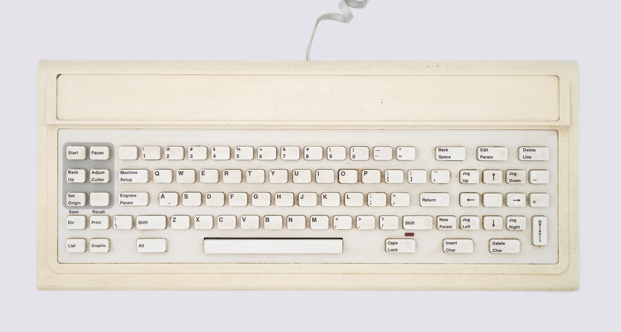
It’s that Caps Lock that made me pause.
Obviously, this keyboard is a repurposed PC or PC/XT layout, with ten function keys on the left, and the messy blended keypad on the right.
But that Caps Lock… that Caps Lock looked so goddamn familiar for a different reason.
It took me a while to realize and piece it all together.
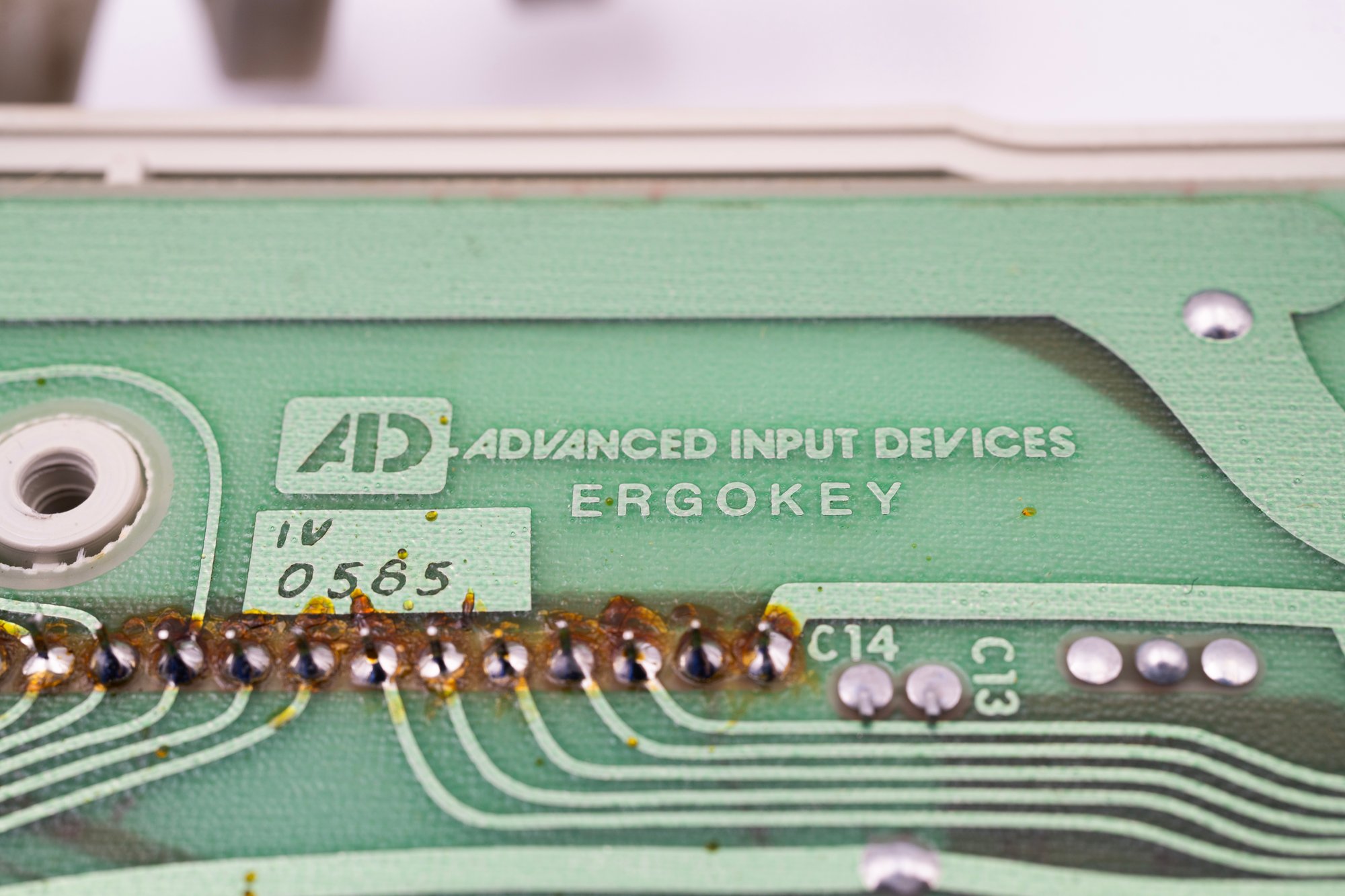
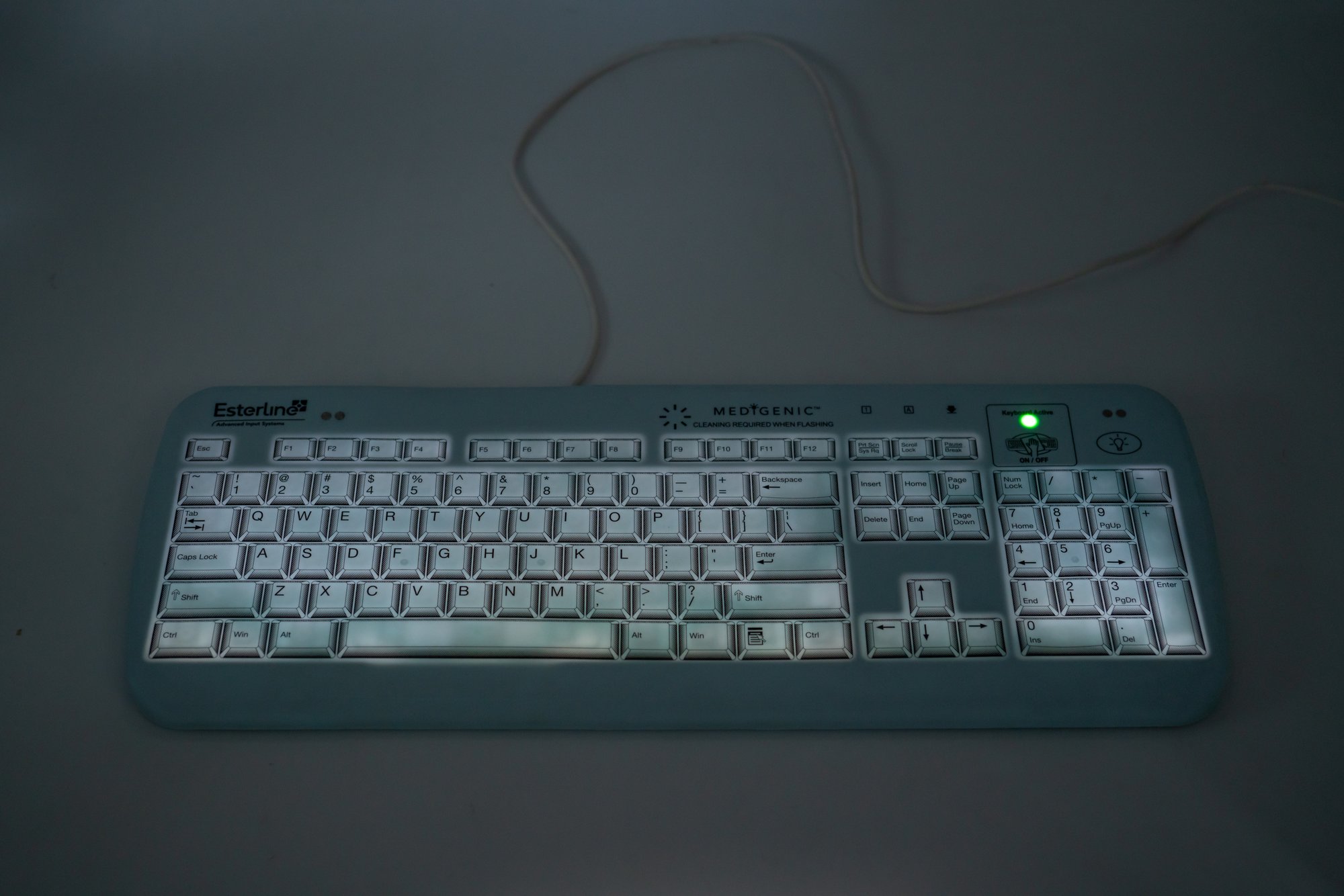
This keyboard was made by Advanced Input Devices, a keyboard maker usually supplying these kinds of esoteric professional keyboards. I wrote about one of their products before – the really strange medical keyboard:
But before this keyboard, back in 1982, IBM asked AID to help them with their upcoming and highly anticipated home computer.
You know the rest of the story from chapter 23. PCjr was a spectacular flameout, blamed in a large part on the spectacularly awful keyboard.
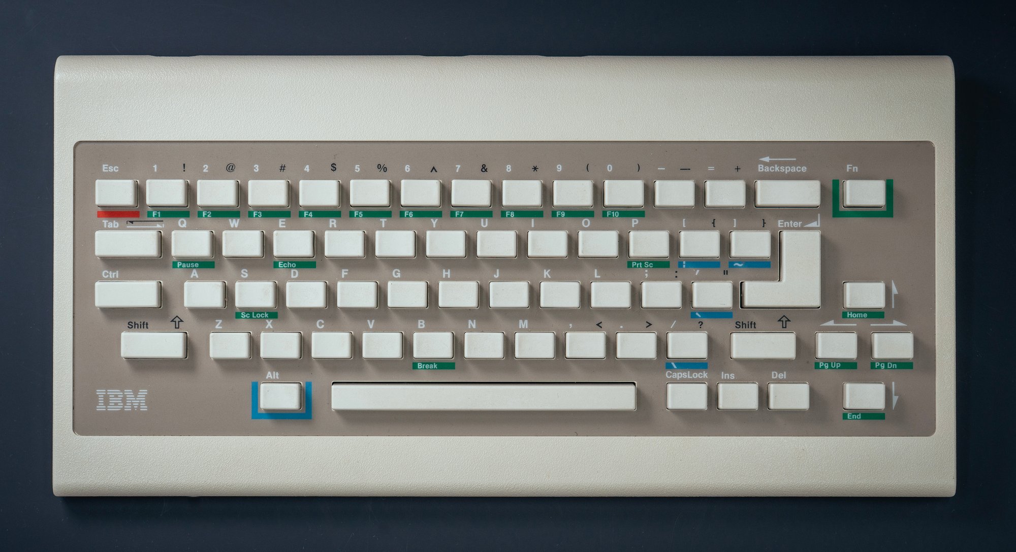
This engraving keyboard is basically the same technology from the same company. It feels so similar that I wonder if connecting it via a reverse-engineered dongle we built in the first first issue of this newsletter could make it come to life.
It is strange to imagine PCjr, of all things, being oddly connected to this fascinating space. Is it a redemption arc for this particular keyboard? No, not really. For all I know, people using the New Hermes engraver probably hated its keyboard as well.
But in this series whose theme seems to rapidly approach keyboards basically never end, it’s nice to know that this world can feel like a small world, too.
Marcin
In a few days: My favourite part of any keyboard.
This was newsletter №49 for Shift Happens, a book about keyboards. Read more in the archives