Cover story, pt. 1
The book will start shipping soon! If you have lost track of Kickstarter updates, please supply or verify your address by following these instructions.
If you are not a Kickstarter backer or later pre-orderer, I opened up a bunch of recent updates to everyone, and they might be interesting to read if you want to see more of the process of bringing a book to life: July update, photos from the printer visit and the sequel, August update, and September update.
⌘
Many years ago, I received design validation in what was perhaps the most surprising, most genuine, and most delightful way it’s possible to get it.
I wrote before how much I love the Computer History Museum. I’ve done a bunch of things there: giving tours, photography, digital signage. At some point in 2009, wanting even more, I volunteered to help design a booklet accompanying the 50th anniversary of the integrated circuit.
The words and photos came from an online exhibit made by one of the curators; my job was to put them together as a printed artifact. I haven’t designed anything for print before, so I spent a great amount of time on this project. I based the colour scheme (dirty red + yellow) off of the Museum’s logo. I picked the font that felt appropriate (Chaparral). And I sweated some of the type details I already knew of, but got to practice for the first time: the dashes, the quotation marks, the small caps, the mysterious numero. The booklet contained perhaps the totality of everything I knew about typography then.
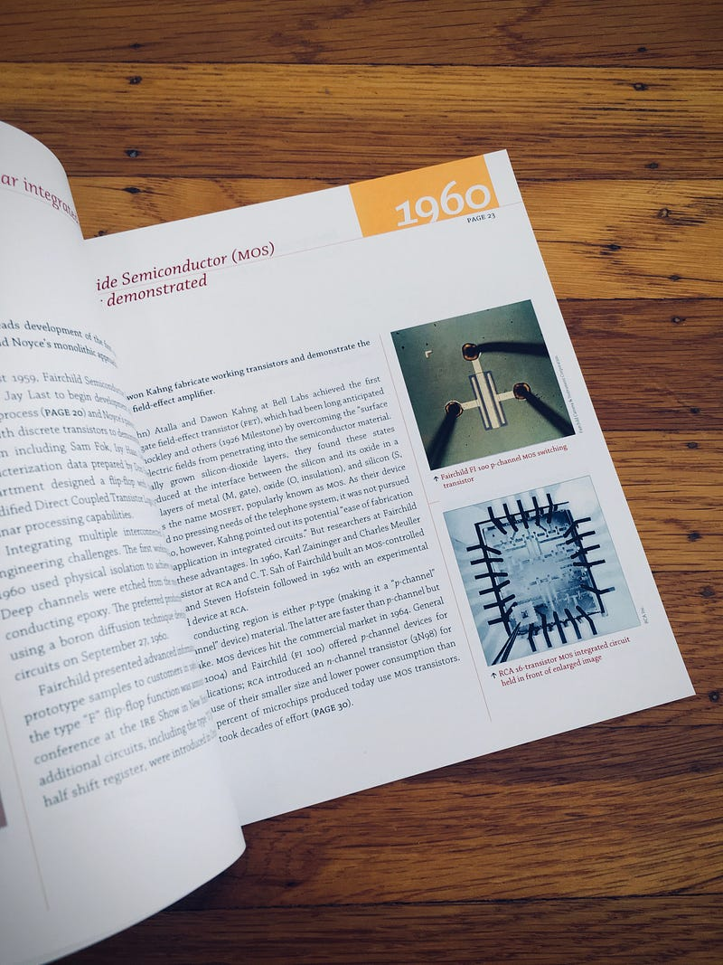
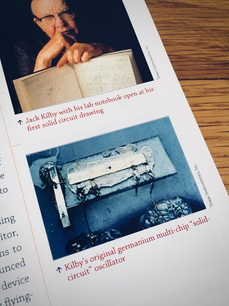
I worked hard to put together all of the pages. But this was easy compared to also having to design my first cover ever.
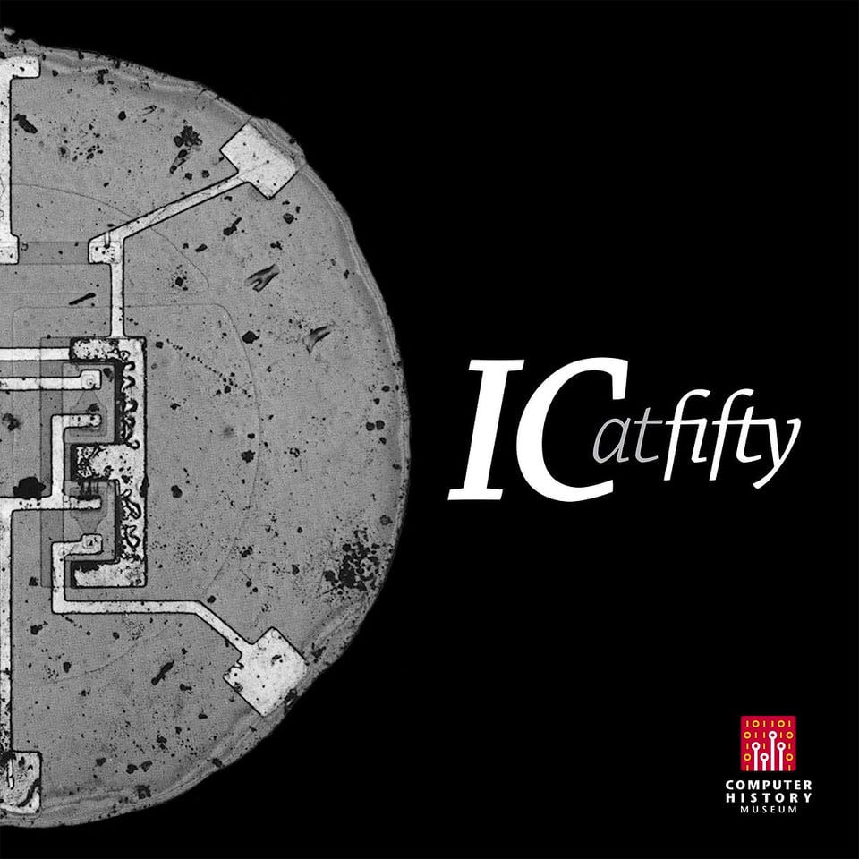
I’m glad that the printing service we used had limited options, because without constraints I would be lost. I eventually picked a square form factor to pay homage to all of the integrated circuits being square by nature, and I made the cover black to blend with one of the stark photos that were available.
The event was called IC@50, but I never found a way to make that combination of glyphs look not hideous. Instead I came up with an idea of a stylized wordmark that said IC at fifty, spelled out and set in italic to bring a bit more humanity into the technical space.
Chaparral Italic came with a ligature for fi. With charming naïveté and without asking for any permission, I just drew my own matching ligature for fty in Illustrator. I then put the wordmark and the photo on the cover, off center, for what I hoped would create a surprising balance.
Then I replicated the same lock-up on the first page.
I bet this idea has a name in typesetting, although I still don’t know what it is. I don’t know where I stole it from, either. To me this treatment felt like a foyer, a welcoming little detail that gave the reader continuity between the outside world and what was happening inside the booklet.
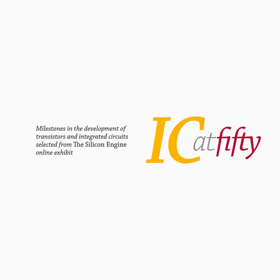
I ended up agonizing over this perhaps more so than anything else. The cover was on thick, glossy paper, but the rest of the book came on matte stock. I needed them to align perfectly, and even though they did so in InDesign, I suspected that wasn’t enough. I ordered a test print at my own expense and had to tweak the logos to be in different locations on the screen, only so that they both overlapped perfectly in the physical world. Eventually, another test print confirmed I got this right:
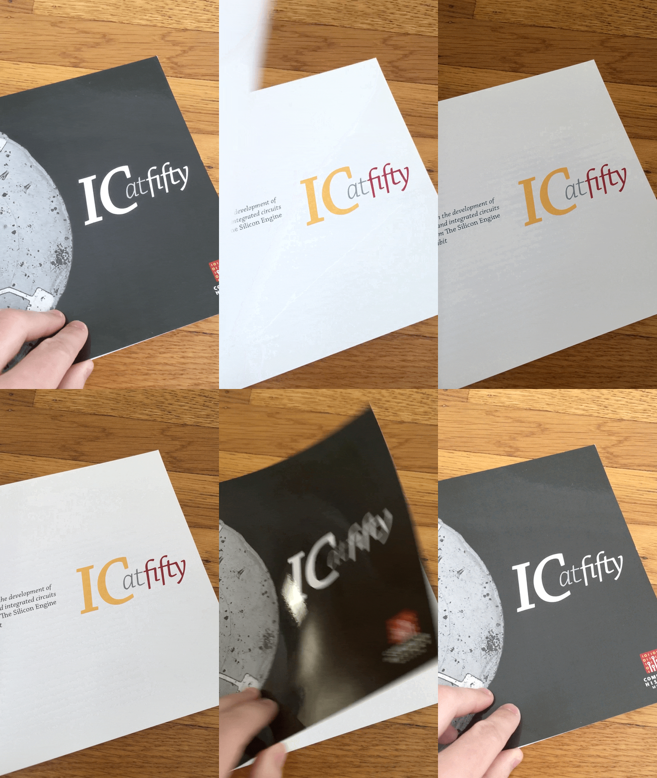
I ended up flipping open and closed the booklet some hundreds of times, happy about that thing digital typography takes for granted: two things in perfect alignment.
And I put in a little personal touch, too. Everywhere I’ve seen this before, the cover was colourful, and the repeated title black. But here, I went against tradition and I’ve done it in the exact opposite way.
⌘
The evening of the actual integrated circuit celebration came a few weeks later. One Wednesday night, the Computer History Museum put together a series of talks in the auditorium of their impressive building in California’s Mountain View. The organizers also ordered hundreds of copies of the booklet, and put one on every seat in the large auditorium.
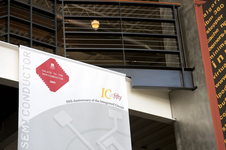
To a pixel-bound designer and only an aspiring typesetter, seeing so many copies of something I helped put together felt wonderful. But the arriving guests looked through the brochures and quickly put them aside. Soon, my excitement wore off, and the exhaustion of the busy work week took over. I slouched in my seat somewhere in the middle of the auditorium, and tried following the lectures with my brain slowly shutting down.
But then, a few rows in front of me, I noticed a person methodically going through the brochure. Since none of the words were mine, and none of the photos came from my camera, I couldn’t really take credit for it. But I did feel some pride. Someone was actually reading something I help put together.
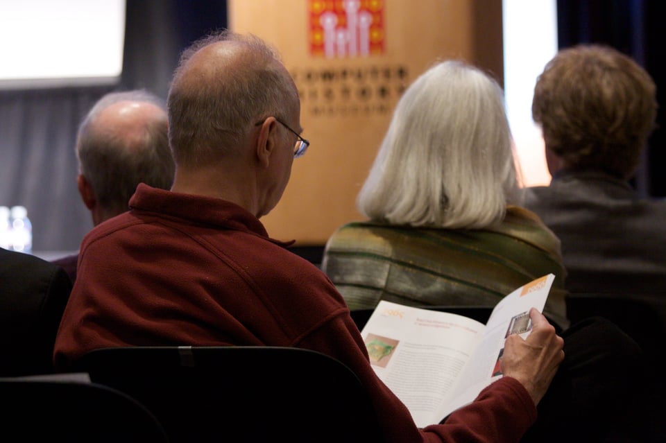
I couldn’t help but creepily keep eyeing that person. A few minutes later, he turned his head briefly and I realized I actually knew who that was. The person reading the brochure was professor Donald Knuth, a well-known pioneer of computer science, recognized as the author of the seminal series The art of computer programming, as well as a whole bunch of other accomplishments.
For a second, this was thrilling. But then, a new realization scared the hell out of me. I remembered Don Knuth wasn’t just a programmer. He spent a lot of time at the intersection between type and engineering: creating a typesetting engine called TeX, designing some iconic typefaces expressed in code, and writing a book called Digital typography.
I myself occupied the same space that saw Knuth as one of the pioneers. Up until that point, most of my typographical experience involved not just pixels, but also programming. I spent a bunch of my teenage years designing routines to render bitmap fonts and to edit them. Later on, I was proud of some complex algorithms and workflows I put together; I even learned 3D Studio just so I could render my letters in the highest quality possible.
After years of amateurish digital typography, I stumbled into real, paper typesetting a bit backwards, and this booklet was my nervous foray into it, the first thing I put together that was printed in a quantity larger than “one.” I still felt like a fraud. And here was someone who could be seen as a father of the space of coding + typography, carefully inspecting something I made.
My tired brain didn’t help, and my internal defenses were down. I imagined Don Knuth coming up to the Museum’s CEO after the event and complaining about my typesetting – or, at the very least, looking at the colophon and committing my now-tainted name to memory.
None of this happened, of course; I only learned a few years later that this was the impostor syndrome writ large. And in the meantime, Don Knuth kept leafing through the book, and I kept watching, unable to look away.
Then, some time into the lectures, another man sat right next to him. They exchanged a few hushed words. And then Don Knuth did something that took me completely by surprise: he grabbed the brochure, and demonstrated it to his friend by opening and closing the cover a few times.
There was no doubt about what happened, and it felt hard to believe. Don Knuth himself was doing the very same thing I’ve done hundreds of times: he was actually showing someone how the black-and-white wordmark on the cover, and the colourful title on the first page aligned perfectly.
⌘
This was almost 15 years ago.
I earned my typesetting stripes since and have shed a lot of my impostor syndrome, or at least moved it to a higher level. I’ve done more digital typesetting, more real typesetting (besides, perhaps real typesetting now happens around pixels?), and various other creative projects. No one else ever mentioned the two wordmarks aligning perfectly. And it won’t be a surprise that I have never since received a validation that felt so authentic and pure like that one evening.
I’ve been thinking about it a lot since, and came to two realizations.
The first one is: tell the creators what you admire about their work. Talk about broad strokes, if you want, but also talk about details. They almost never hear about them, and in my experience it has been delightful to realize that someone else cared enough to notice something small, and cared enough to tell you about it.
But there’s also the second one: as a creator, talk about those details anyway.
Yes, it might feel disappointing. Wouldn‘t it be better if people just noticed the details – and their significance – on their own? Wouldn’t it be great to see someone you admire recognizing a moment of deep craft in something you made?
But I wonder how likely that is. The lucky observation at the Museum might have been a one-in-a-lifetime thing for me. Besides, nobody knows what’s inside your brain, and your work won’t probably be important enough to be put in museums and studied by generations, pointing out the significance of the smallest of things. There’s nothing wrong with helping people appreciate your thing – or seeing more value in it – by simply telling them about its intricacies and meanings.
⌘
I’ve been trying to practice these two things since. I try to reach out to people whose work I admire to tell them that, often. (Will I send this to Don Knuth? You bet I will.)
And, as for the second part, vis-à-vis the book…
I shared some of the details already – the chapter titles, the visual style guide, the strange process of making photos look better. Volume 3 will contain a literal list of all easter eggs in volumes 1 or 2, because… why not? When the book is out I will be able to share so many more details in future newsletters, and perhaps even a “design livestream” (would that be interesting to you?). I am also preparing a “treasure map” of the book that tells you all the little stories and details of its many photos, design, and typographical decisions.
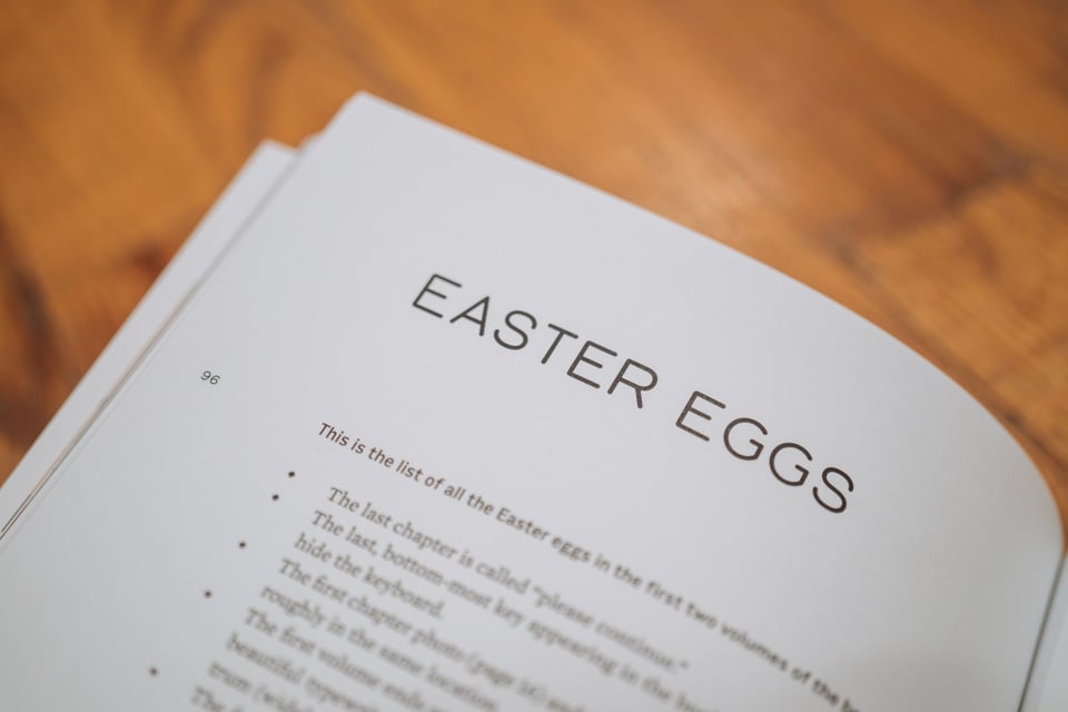
Once again, the book and its siblings contain perhaps the totality of everything I know about typography now. The dashes, the quotation marks, the small caps, the numero… I spent so much more time on them than on their equivalents in the IC at fifty booklet – and I also spent so much more time on so many more details.
Some of the stuff in the book – my attempts at controlling InDesign programmatically, writing software that makes a font within a font, a 3D book viewer, creating tools to simulate typewriting, or to simulate typewriters – I am so, so proud of. They come from the same space of digital typesetting, of fonts and code, of typography engineering that I still love to death. Gorton, that contentious font I resurrected and then commissioned a proper version of (Gorton Perfected, whose name itself is an easter egg) has more than passing conceptual similarity to Donald Knuth’s contentious Computer Modern.
You’d think that all should help. But I am nervous. The first booklet wasn’t really fully mine. This time around, it’s my words, my photos, my designs, my typography, and even the printing process I finished and approved.
⌘
One of the last things I had to finish and approve before the book would be truly done was… a booklet; the 32-page “The day Return became Enter” brochure that so many of Kickstarter backers chose as an additional reward. This one was surprisingly tricky. The story needed more rewrites than I imagined. I also promised myself I wouldn’t reuse a single photo from the book – and it turned out finding good photos of Return and Enter that are not super repetitive is really hard.
I agonized over the new booklet for a few weeks, and eventually through a combination of hard work and Stockholm syndrome I convinced myself it was good enough. I even added a couple easter eggs and fun details.
Here’s the first one.
When I received the proof from the printer, I realized I had nothing on the first page. Opening the booklet to a completely empty spread felt okay on screen. But on paper, in my hand, it felt incomplete.
And then I remembered that night at the Museum, 15 years ago.
⌘
I find meaning in those little details and those personal histories, and what do we have in life if not meaning?
Despite such a distance between them, that first booklet and this last one will now share one design element because yeah, I repeated the title and yeah, I asked the printer to make sure it’s aligned and yeah, despite the tradition I made the first title black-and-white, and the second set in colour.
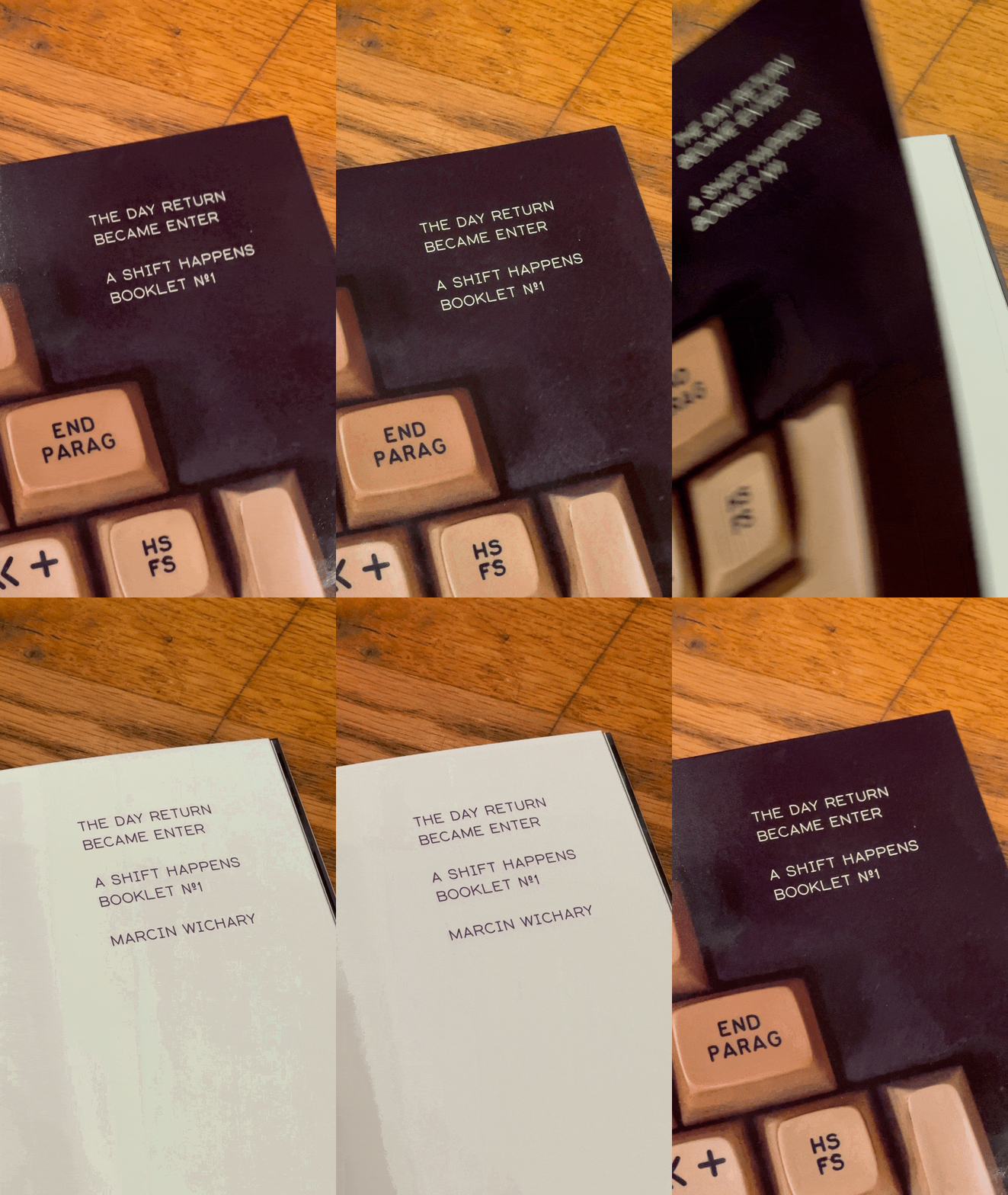
And I want to tell you about it now because I know it won’t really ruin the surprise, and perhaps the opposite: If one time you get to see the booklet, you might remember this newsletter, the story of another booklet from years ago, and that design validation from a certain professor that I was so fortunate to catch.
You will then choose to show it off to a friend, or maybe you won’t. This time around, I’ll have no idea.